Over the past few years working at agencies, I've had my fair share of experiences with content management systems (CMS). And I've seen the good, the bad, and the ugly. Overall, early on in my marketing career, HubSpot was the first platform that helped me understand how a website can work in conjunction with goals. And that's because HubSpot is more than a CMS.
HubSpot is a Content Optimization System, or a COS, which is a term they coined a few years ago. The definition seems to evolve as HubSpot does, starting as a way to say "we're an all-in-one solution," and now, being a way to express that they're the only all-in-one-solution. And in my opinion, unless you want to install a million plug-ins, widgets, custom-coding, and integrations, HubSpot is the only all-in-one solution out there for websites.
Our Go-To HubSpot COS Examples
Even with HubSpot's impressive credentials, a lot of potential clients still want to see the platform in action. That means examples. Because as much as HubSpot does on the back end, the tool still needs to support an aesthetically pleasing website that's easy to build, navigate, and optimize. And of course, HubSpot delivers in spades.
Here are few HubSpot COS examples that show the flexibility and potential of a HubSpot website, with some insights about why they're so excellent.
International TEFL Academy
When students want to teach English abroad, they go to International TEFL Academy (ITA.) However, when an organization like ITA needs to improve their website performance, they turn to a growth partner. According to Ryan Scott, the head of our inbound team, a few challenges stood in the way of ITA's success.
"The problem was that their website looked older than their target market of millennials. It lacked the simplicity, clarity, and ease of use demanded by its users. Their website is massive, with hundreds of pages, documents, and other types of content. There was a problem with duplicate content in many places due to information architecture challenges, and many pages were not optimized for SEO.
Thus, the site navigation had become bloated, and users had a bad experience."
To drastically improve that experience, we used the HubSpot COS, as well as the Growth Driven Design methodology, we to redesign ITA's site, smoothing out their buyer journey and improving engagement.

After the redesign, ITA's website brought in way more website traffic and leads, with impressive stats demonstrating the drastic improvement:
- In 2017, the website bounce rate in Q1 was 59% (a 6% drop)
- 26,163 leads were generated, also in Q1 of 2017 (28% increase)
- An 18% increase quarter over quarter in 2017
To date, this website has been one of our top performing rebuilds. You can read more about it more in this blog post about how a website redesign can dramatically increase conversion rates.
Baker
Baker is the leading CRM platform for cannabis retail, as well as a client of ours. Overall, their website is incredibly easy to navigate and looks great, making it one of our favorite HubSpot COS examples.
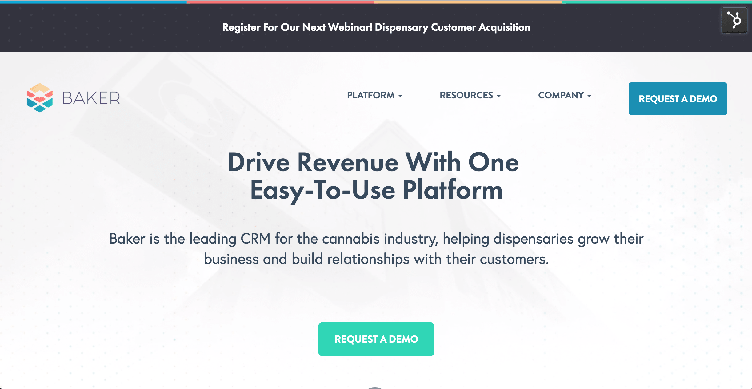
They utilize a variety of HubSpot's website tools to fill their CRM with high-quality leads, such as:
- Lead flows that target new visitors and promote incredibly valuable webinars, eBooks, and more
- Smart forms to collect email subscribers, demo sign-ups, etc., and send their information directly to the HubSpot CRM (which is free to use.)
- Sleek modules that keep a consistent look, feel and branding flowing through the site
With a site similar to Baker's, you can collect more qualified leads and opportunities for your primary offering (such as a demo for their platform.) You can foster trust through sharing customer testimonials, feedback, and quotes, which we always place strategically throughout our sites.
RocketSpace
RocketSpace is the top coworking accelerator for tech startups, with locations in San Francisco and London. Their website has a modern, bold look, making it one of the many HubSpot COS examples that demonstrate the possibilities for startups and tech companies. Tyler Naples, one of our Inbound Marketers, appreciates the thought behind the UX.
“From a user experience standpoint, the homepage provides visitors with three distinct points of entry — startup growth, acceleration, and corporate innovation."
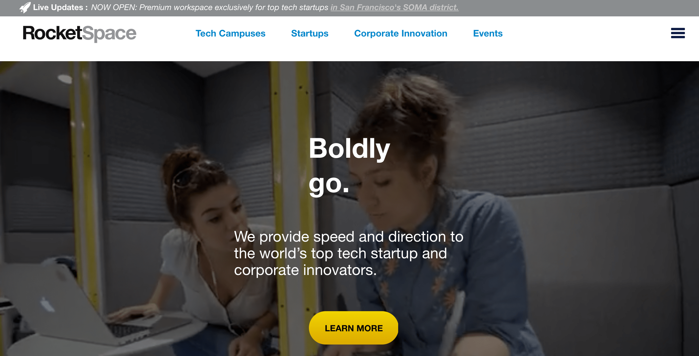
Behind the scenes, the site has a lot of the same HubSpot features as Baker, along with exclusive features of our SprocketRocket platform, such as:
- Our customer smart-pop up that displays custom marketing based on the lifecycle of a lead
- A hero module that makes it easy to upload a video header
- Custom-built modules for better page structure and easy and quick optimizations
If you build a website similar to RocketSpace's, you can provide a wealth of content for your leads through a HubSpot blog, smart content, and streamline their path through the buyer journey.
In the video below, you can see more about the work we did with RocketSpace.
SprocketRocket
I'm biased, but I love SprocketRocket's homepage. SprocketRocket is our platform, with design and conversion tools and modules for HubSpot. From the beginning, the site is engaging and fun to use, and it's due to a killer homepage content strategy. Since we spent time on that strategy before executing, we ended up with a fantastic design.
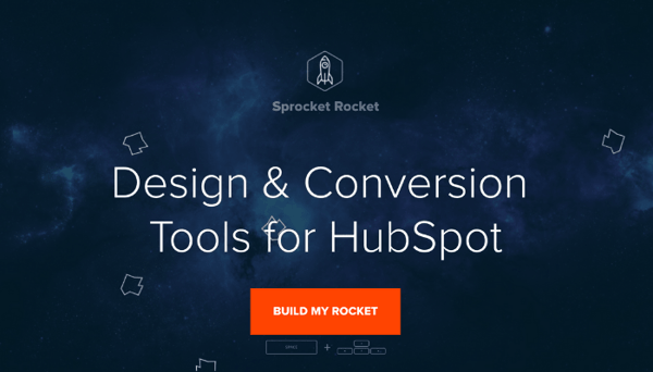
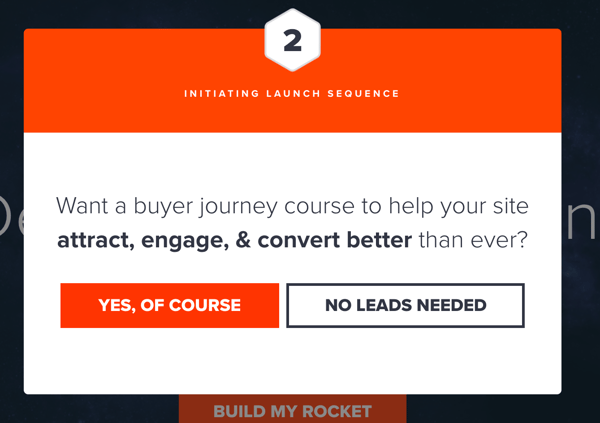
When you click "build my rocket", a pop-up brings you through a "launch sequence"which is a series of qualifying questions such as whether or not the lead is using HubSpot, etc.
There are a lot of resources on our SprocketRocket site, such as a video explaining the value of the tools, a learning center, and landing pages that lead to our offers, such as our strategy kit. It's all very seamless.
Lean Labs
Our actual website, Lean Labs, is also a great example of a HubSpot COS website design. Following the GDD methodology, we prototyped our pages and refined our messaging before designing the site, and it shows.
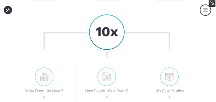
From the very first page, it's obvious what do, and where we excel. Our design is modular, which are building blocks within HubSpot that enable us to make website pages quicker and much more effectively. Miles Ukaoma, the head of our Growth Driven Design team says the little details of the homepage are his favorite aspect of the site.
"Like the animation of the geometric shapes behind the laptop as the homepage renders or how the logo pans between navy blue and white to give as much contrast as possible depending on the background, it’s hovering above. These small details give the website a craftsman style that only comes when you enjoy what you’re doing."
The Next Steps To Getting The HubSpot COS
If you're considering a website build or redesign with the HubSpot COS, it can seem overwhelming to start. But it doesn't have to be. Using the right methodology and process, you can easily construct a HubSpot website that's intuitive, user-friendly, and can grow and expand with your business. One of the best things about HubSpot is the ability to support small to large websites without losing any functionality or support.
Additionally, although HubSpot can seem expensive when you're starting out, there are a ton of ways to save on the platform in the beginning. We work on HubSpot sites all the time, and through our experiences, we've picked up on a few tactics to get more value from the platform sooner. Here are all the details about how you can save up to 60% off HubSpot in your first year.