Who doesn't like to travel the world?
International TEFL Academy (ITA) has helped thousands of people realize their dreams and travel the world. How? By equipping them with the knowledge, training, and opportunities to teach English as a second language in a foreign country.
At Lean Labs, we were ecstatic to work with ITA, because they are such a cool company. Not only that, but their website was already attracting hundreds of thousands of visits. Where most of our clients come to us with a traffic problem, ITA was different.
They had the traffic, and we were joining their team to level-up their lead generation and nurturing machine.
Building A Beautiful Brand Experience
When we first started working with ITA, one problem they faced was clarifying a smooth buyer journey.
But, ITA is a great brand with a burning passion for equipping teachers to teach English in foreign countries. They have been a HubSpot customer since they were founded in 2010, and have employed inbound marketing from the beginning. ITA's founder, Bruce Jones, has been to the Inbound Conference six times! This made it easy for all of us to get on the same page.
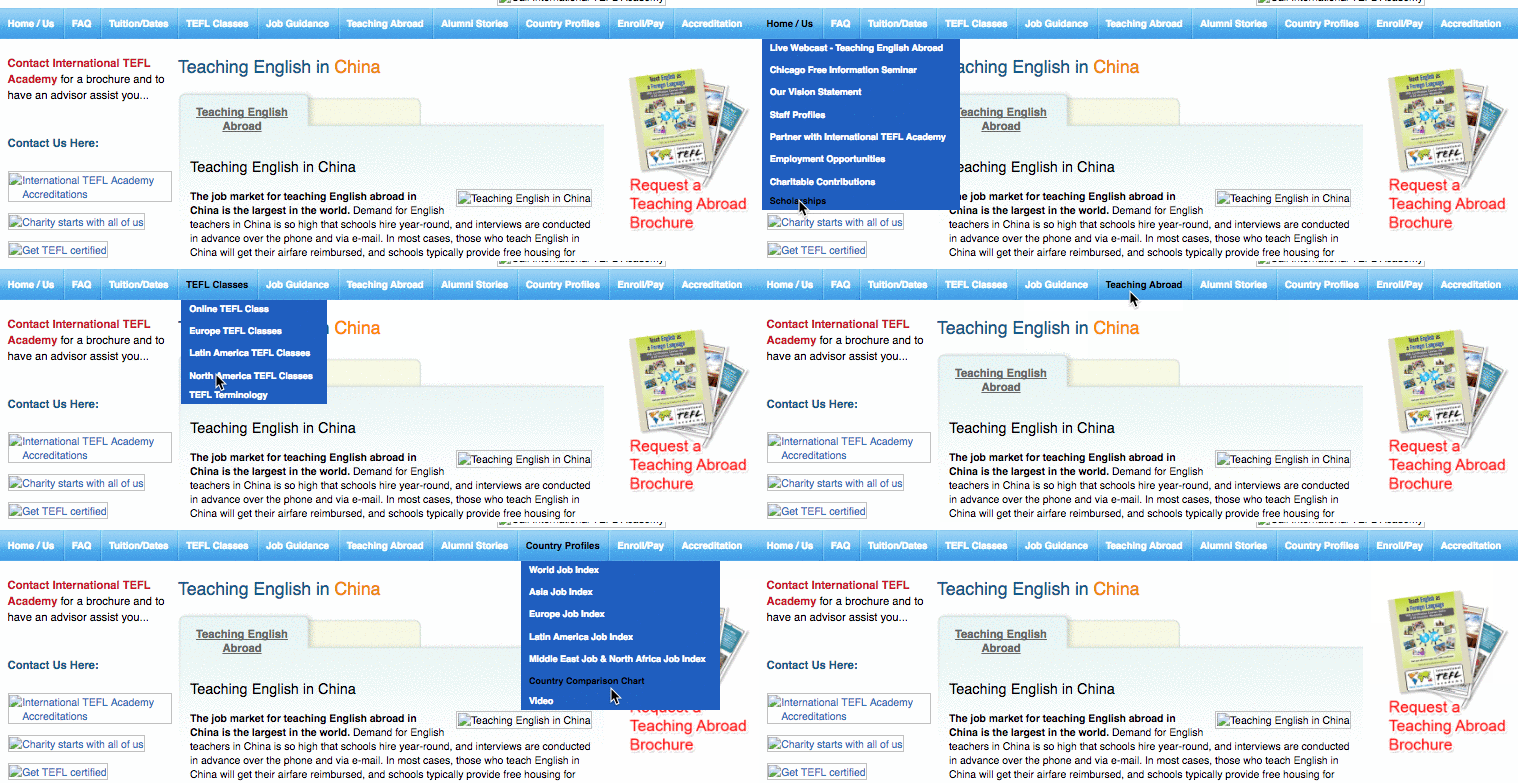
The problem was that their website looked older than their target market of millenials. It lacked the simplicity, clarity, and ease of use demanded by its users. Their website is massive, with hundreds of pages, documents, and other types of content. There was a problem with duplicate content in many places due to information architecture challenges, and many pages were not optimized for SEO.
Thus, the site navigation had become bloated and users were having a bad experience.
So, we started working together to create a clearer buyer journey, upgrade the site design and brand experience to transform information overload into a simple and effective buyer journey.
In other words, we wanted to make the path to 'customer' easier, smoother, and faster.
We Set Clear Goals for Success
- Create a website that appeals to millennials in both design and message.
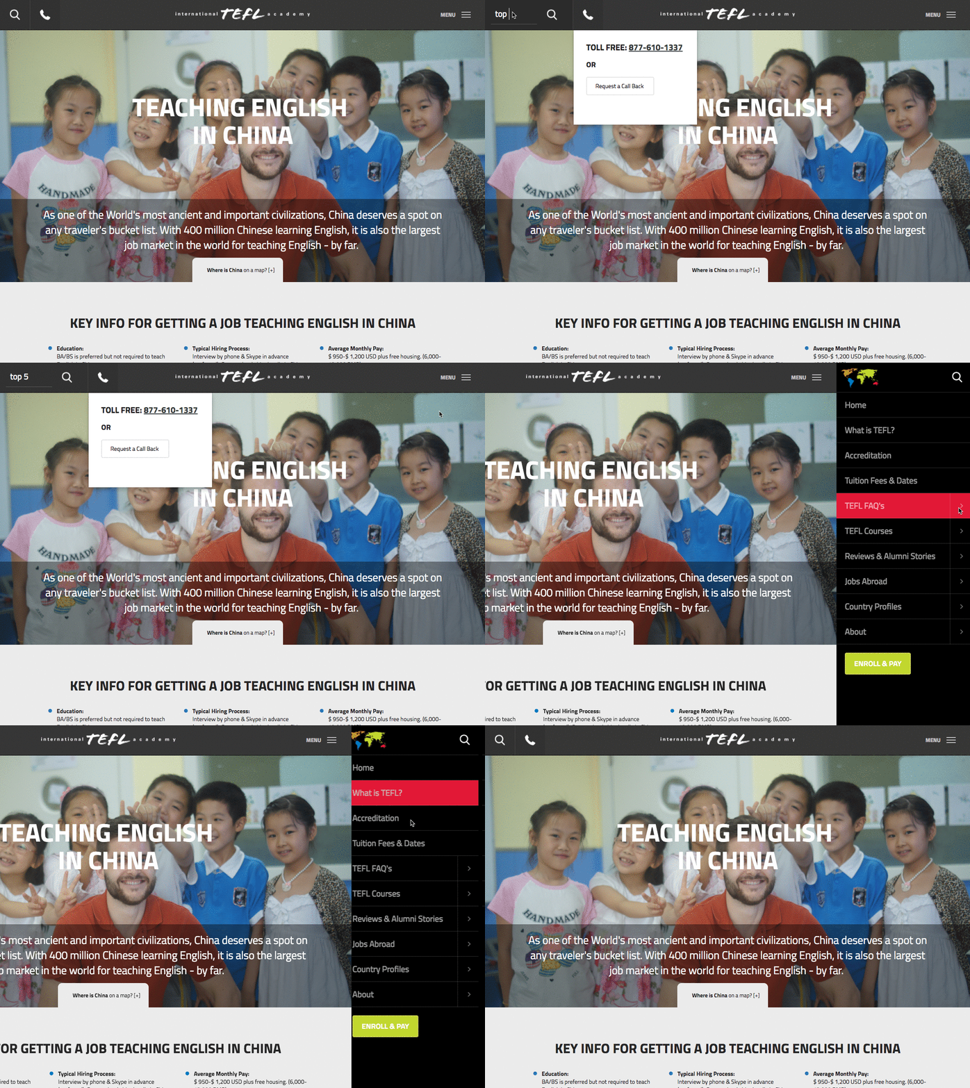
- Prune the ultra-complex navigation and replace with a simpler experience.
- Improve landing pages for increased conversions.
- Improve the flow and experience of site pages.
- Make the site responsive, so it could perform well on all platforms and devices.
- Strategically create calls to action to get the right offer in front of the right people.
A Before and After View
Navigation Before the Redesign

Navigation After The Redesign

But Did It Work?
While design is always pretty to look at, whether or not it makes a difference can only be revealed in the numbers. Just because something is "prettier" to us doesn't mean it will perform better to the most important audience: the customer.
So, let's look at the numbers we've been able to turn for ITA:
Total Traffic Increased!

Yes, we know design doesn't directly impact traffic. Or does it?
While their website is very efficient at generating tons of traffic, having a good presentation of the information and content that traffic is after does make an impact.
- In Q4 of 2016, the website generated 525,156 website visits, which was a 5% increase over Q3.
- In the first quarter of 2017, that number has increased even more dramatically, logging 628,616 visits for an 18% increase quarter over quarter.
Today, their website consistently ranks in the top-3 positions on Google Search for major industry keywords, like "Teaching English Abroad," and "TEFL Certification."
Site Engagement Increased!
While traffic can be attributed to a lot of sources, the engagement of the site really comes down to two things: content quality and user experience. Since the content quality has always been a high level, we can attribute the following statistic to an improvement in the user experience:
- The website bounce rate in Q3, 2016 was 68%
- The website bounce rate in Q4, 2016 was 65% (3% drop)
- The website bounce rate in Q1, 2017 was 59% (a 6% drop)

The bounce rate continues to fall as website traffic continues to grow. That's some awesome stuff right there!
Lead Generation Increased!
What good is a lot of traffic and a great website if it's not generating leads, right? There are three factors at play for increasing leads.
First, again, the site content is important - and ITA's content is awesome. Second, great offers and CTA placement has a huge impact on lead generation. Finally, having landing pages that are frictionless and attractive has the final say whether or not a visitor will convert to a lead.

After focusing a lot of time and energy on the lead generation aspect of the site, we saw some exciting increases as well:
- 15,895 leads were generated in Q3, 2016
- 19,756 leads were generated in Q4, 2016 (22% increase)
- 26,163 leads were generated in Q1, 2017 (28% increase!)
Increased Conversion Rate from Organic Traffic

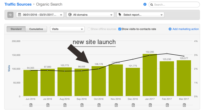
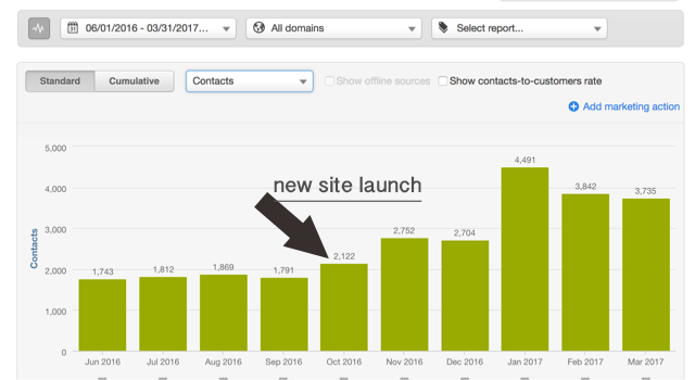
Organic traffic has increased, but since the launch of the new site, the conversion rate of organic traffic has increased over 50%. This is largely in part to the clarity of the buyer journey when the organic traffic hits the site.
And the impact is dramatic. Look at the increase in organic leads:

Marketing Qualified Leads
Total leads are just half the story. How many of these leads are qualified?
- 7,274 MQL's were generated in Q3, 2016
- 10,297 MQL's were generated in Q4, 2016 (34% Increase!)
- 12,245 MQL's were generated in Q1, 2017 (19% increase)
Quarter-over-quarter is only half the story. ITA experiences a cycle in lead generation, which means comparing Q1 to Q4 isn't exactly an apples-to-apples comparison. When you compare Q1 2017 with Q1 2016, there has been a 50% increase in the generation of MQL leads.
Increased Revenue
In November, 2016, the first full month of the new website, we broke our monthly revenue record. And it wasn't even close - we broke our monthly revenue record by 20%! That trend looks to be the new normal, as we're currently are on pace to grow revenues 30% this year compared to 2016.
All That Winning
Like we said before, Lean Labs is not the hero of this story. The real hero is ITA.
They have an amazing team, and an even more amazing product. Not only are they furthering education around the world, but they are literally making thousands of people's dreams of world travel come true.
You can't help but win with that combination.
Lean Labs has been privileged to work with such an amazing company. We have provided the tweaks, design elements, and a little knowhow of information architecture. And we look forward to winning more with this amazing company in the future.