One of my favorite films about advertising is Art & Copy.
The documentary covers some of the most influential ad campaigns of all time. It features popular ads such as the "Got Milk" advert and the "I Love New York" slogan. It discusses the importance of developing an impactful message for a campaign, rather than solely focusing on the design.
In my experience, you should take the same approach for landing pages.
When you prioritize the landing page copy, you can ensure that customers understand the value of your offer quickly. With impactful landing page copy, you can trigger the same moment of understanding that you probably had during the first "Just Do It" Nike commercial back in 1988. You want them to say, "oh, I get it!" within the first few seconds on your page.
However, here's the challenging part.
As you see in the documentary, creating this moment of connection is hard to create. And it should be. Writing exceptional copy is challenging.
But it is critical for conversion. That's why you need to level up your landing page strategies. You need a process that prioritizes the message. With a revised approach, you can churn out high converting landing pages that actually provide a return on your time.
High Converting Landing Pages: What Designers And Developers Know
"If you can find that kernel, the core of what that product is so that when you talk about it, no matter how you talk about it, people respond and say “Yes, that’s right!”, then if you talk about it in a strong, interesting, memorable way, they say “Yeah that’s right, I’m gonna buy it." – Jim Durfee, Art & Copy.
When you have an exceptional understanding of your customer, your competition, and how you fit within your industry, you create outstanding landing pages. Period. Aesthetic is important, but it's not everything. And often, when you rely on the design of your page to drive conversions, what you're doing is passing the buck to your developer or designer.
You ask them to elevate a weak message instead of developing something better. Often, these types of pages lacks the impact necessary to get a customer to convert. And if you ask any designer or developer, they'll tell you that of course, they can put lipstick on a pig and make mediocre copy look nice. But if you provide better copy and flow upfront, you can create something really memorable.
Here are the most effective tactics for creating these types of ideal, high converting landing pages.
1. Start With The Customer
Your landing page visitors don't appear from thin air. They come from ads, social media posts, and other pages on your website. They find your content through organic search or a referral from a friend. Those sources don't always provide context about who you are, or why you're the right solution.
At this stage, the right play is to educate them about their initial search or reason for coming to the page, and earn their trust. When the visitor doesn't know much about you and is looking for the answer to a question, it doesn't make sense to skip ahead and sell to them aggressively.
They're not ready.
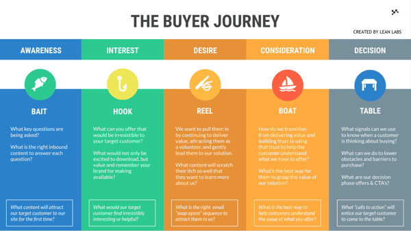
That's why I use a buyer journey map, as well as a customer journey exercise to ensure I understand where my customers are coming from, and what their mindset is.
The buyer journey has five stages, Awareness, Interest, Desire, Consideration, and Decision, and the template I use looks like this:
Each stage plays a critical role in the customer experience.
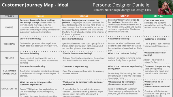
The other customer strategy template, the customer journey map, breaks down that experience in more detail. When done correctly, it can help you uncover gaps in your process.
You will fill out a template that documents their current experience, as well as a template that documents an ideal experience.
You can read more about how to conduct this exercise here.
This upfront strategy work is critical. If you speak to your customer in a way that doesn't match their current mindset or motivation, you will lose them. For every landing page, you need to determine:
- How the customer found the landing page
- The particular challenge they're trying to solve
- How are they're currently feeling
In the case that you don't have a lot of customer research to work from, HubSpot has an excellent resource about buyer personas. You can start here and then pick up the tips from this list later.
2. You Need An Outline
For a landing page to come together seamlessly, you need to wireframe it first. It's the same as writing a story, an essay, or a blog post. Without that order, your message will seem disjointed and nonlinear. If you're going to create a landing page, it's worth doing well.
To start, you want to outline the page from beginning (header) to end (call to action and next step.)
You want to describe how the offer solves the customer's exact problem, the steps associated, as well as any stats or authority you can provide to earn their trust.
It's a tall order.
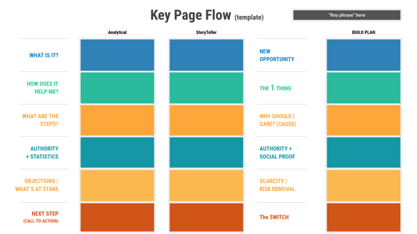
I use a page flow to make sure I don't miss anything.
Using this, I can hit all of my most critical points and improve the flow of the landing page.
If you're still struggling with the message during this exercise, I would recommend hiring a website content writer. They can work on the content and run it by you later.
If you already have exceptional content and you're not getting conversions, check out this guide on utilizing smart content to get better sales opportunities from your landing pages.
3. You Need A GREAT CTA
Your call-to-action is crucial to conversion. If the offer is weak or doesn't relate to the content on the page or the intent of the customer, they will not convert. Additionally, if the offer is difficult to acquire, you will lose your customer. If you ask for too much information upfront to get the offer and they feel uncomfortable sharing it, you will lose them.
Make sense?
You want a CTA that is:
- Highly relevant to the stage the customer is in
- Matches the content on whatever landing page it's on
- Blows all of your competitor's content out of the water
- Demonstrates your expertise on a particular subject
- Provides your customer with tremendous value
- Is easy to download or acquire
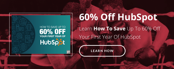
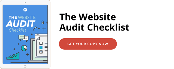
Here are a few of my favorite CTAs from a few different industries.
Every CTA is descriptive and useful to a specific customer or audience. In my experience, detailed cheat sheets, high-quality templates, free training or webinar, toolkits, and interactive worksheets are great offers to start with.Demos and free trials work for later stages.
The secret is to ensure the positioning of your offer makes the customer realize they need to have it.
If your CTAs are tremendous and your clicks are still low, check out this material about building better calls-to-action in HubSpot. If you do not have HubSpot, here are some tips to making your CTAs more enticing.
4. The Page Should Look Like You
Despite the landing page offer, the look and feel of every landing page should match your tone, branding, and voice. You don't want to present a look that's drastically different than your website.
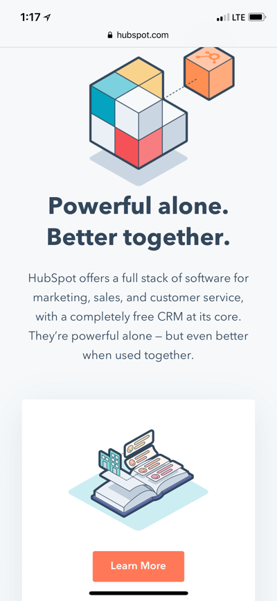
Think of any brand that is comfortable and familiar. Whenever you go to Starbucks, you get the same green logo on the cup. When you use HubSpot, there's a pop of their signature orange on every page. There is never a deviation in style and it all matches.
If the look or feel was different, you would wonder if it was a knock-off.
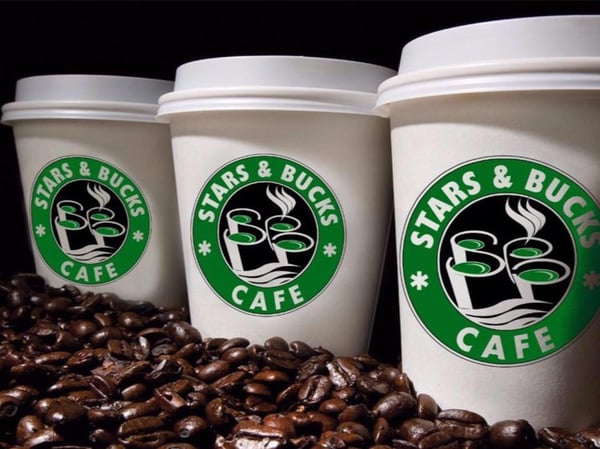 Anyone want Stars & Bucks Cafe? Via this fun Business Insider article.
If you struggle with this consistency on your landing pages, try a few brand voice exercises to help tighten up your brand personality.
A few of my favorite brand voice exercises include:
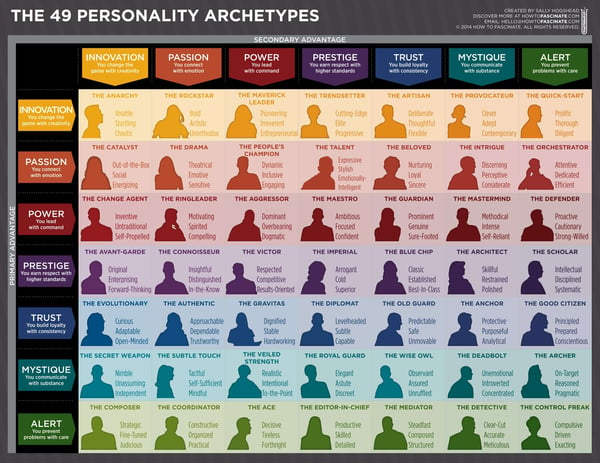
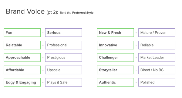
The 49 Personality Archetypes are great for selecting the correct identity for your brand. For example, a brand such as Louis Vuitton is more about prestige and power, while a brand like Audi is about innovation and prestige. There's a small difference between the two, but that difference matters.
By choosing between opposites, you can select a tone to use in messaging and style and stick to it. You can't be fun and serious or be edgy while playing it safe. You need to choose. Otherwise, you will confuse your audience and will switch back and forth between two drastically different styles.
 Bad boy Kermit is not a good look for anyone. Via Imgflp.
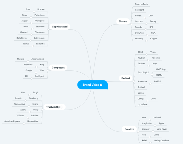
The brand voice map below is perfect for making comparisons between popular brands and their identities.
For instance, trustworthy brands include Ford, Subaru, American Express and Walmart. However, they all have specific adjectives that differentiate them from each other.
If you can't get your stakeholders to agree on the right personality or you need additional guidance, check out this resource. You can learn how to develop a unique voice that can help you stand out from your competitors.
5. Images and Video Matter
For the record, I do not think you always need imagery or a video on your landing page. However, the choice to not place media needs to be intentional. You need to balance it with a decent amount of content, but not too much. Alternatively, too many images or multiple videos are distracting.
I would recommend adding video or imagery if it adds to the flow of the page and helps add context. For instance, a demo landing page could use a video of someone using the product. That fits. However, a lengthy video about who your company is can be distracting on the page.
Another important consideration is the tone of the page and how your customer is feeling at the moment. If you sell disaster insurance, for example, the customer likely feels anxious and emotional at the idea of losing their property in a disaster. You don't want to choose photos where everyone is laughing and smiling.
If you're not sure how your customer is feeling, try using the business model canvas to get more insights. It's an excellent resource for tapping into the customer mindset.
The part of the template that always helps me are their trigger events and existing alternatives. I can identify figure out what the customer is looking for and figure out how they feel about that. I can look at the existing options and find potential frustrations, flaws, and shortcomings about those.
My favorite trick for filling in this part are review sites. For example, if I'm selling an email marketing platform, I can look at common alternatives, such as MailChimp, and see what existing customers are frustrated with.
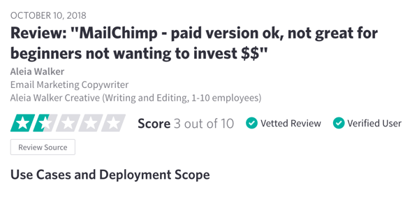
If I know that incoming leads that aren't new to email marketing have experienced issues like this, it tells me something about their mindset. They're tired of overly simplistic features. They know their stuff. They want a platform that can scale with them.
Instead of selecting imagery that shows happy, enthusiastic users, I may choose to poke at those feelings and use images like this:


They work because they match the mood. The customer isn't elated yet. They're frustrated because they haven't found what they're looking for. The same goes for video. You want to tap into how they're feeling and empathize with their plight.
If you're interested in adding videos to your landing pages, but haven't started with video marketing yet, here is how you can use video marketing to increase conversions.
6. Tease The Content
If you have an exceptional offer and a great landing page, but you're still not getting conversions, consider adding a teaser. You can share a preview of what they're going to get from the eBook, worksheet, etc. You will lose the element of surprise, but it may work well for more complex offers that require a better understanding upfront.
It's not a perfect metaphor, but I like the previews that Amazon.com offers for books. You get a peek at the first few pages and can get a feel for the content before you buy anything.
Here's an example of a preview for Anthony Bourdain's graphic novel, Hungry Ghosts.
.png?width=600&name=lookinside%20(1).png)
The teaser works when you know that your customer is already overexposed to content offers. There are a ton of graphic novels out there. What's different about this one?
It's the same with business offers. After a while, signing up for free trials and downloading the same offers get old. To get a conversion, you need to give a taste of the material. Customers need to know they won't be wasting their desktop storage or time on the same old thing.
7. The Page Must Be Accessible From Any Device
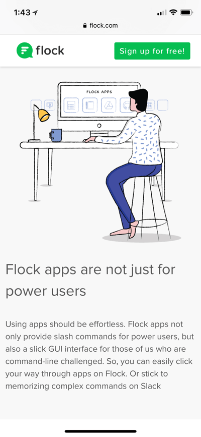
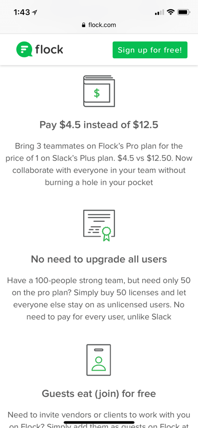
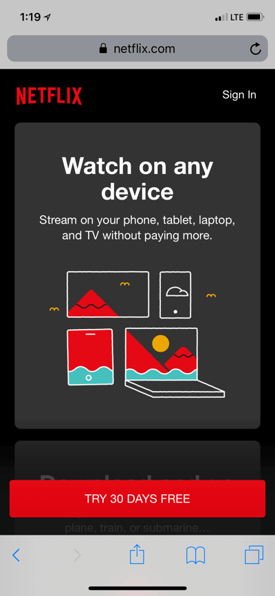
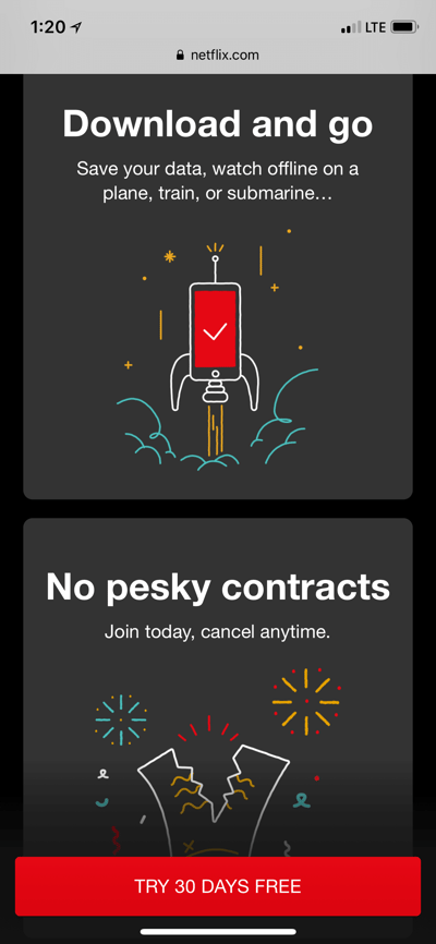
It still shocks me when I find a landing page that's difficult to use on mobile. It's 2018. Over half of website traffic comes from mobile devices. If you're not optimizing your landing pages for small screens, you're missing out on a tremendous opportunity to improve your landing page conversion rates.
Here are a few examples of landing pages that look exceptional on mobile.
For context, I took these screenshots from an iPhone X.
Flock Free Trial Page
Netflix 30-Day Free Trial Page
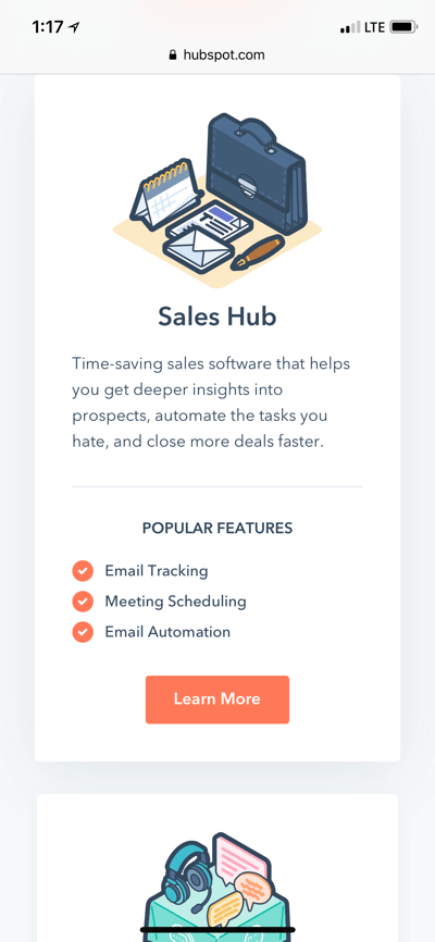
HubSpot Get Started LP
Personally, the Netflix example is my favorite.
The landing page language even recognizes that you're reading from a mobile device. On every page, it's easy to click CTAs, fill out forms, read the text, etc. Your landing page should do the same.
8. It's Not Over When They Convert
After the conversion happens, the experience isn't over. You can quickly lose a lead if you fail to follow-up with them after they download an offer or sign-up for a trial. To get the most from your contacts, you need to master the follow-up. Form fill outs don't matter when you're not doing anything with the conversions.
I see this mistake a lot, especially when companies have very aggressive lead generation goals. They only care about getting 100, 150, 200 free trials a month but they do not actively nurture those leads. Simply put, your customer does not owe you a thing. Even if they fill out your form, there needs to be additional work on your part to make sure they become a customer.
The Most Important Aspect of High Converting Landing Pages
Overall, the most critical aspect of your landing pages is how they fit into your inbound marketing strategy. If you don't have an effective distribution or ad strategy, you won't get high conversions because you're not getting your landing pages in front of the right people.
Without the right visibility, your landing pages will tank because your target audience can't find them. And if this is the case, it won't matter how good the content is or the offer you're promoting. The pages will sit and collect dust. However, with the right inbound marketing strategy, you can ensure your landing pages get the best possible traction.
To learn more about creating an inbound strategy that drives conversions to your landing pages, check out our guide.


.png?width=600&name=customerjourneymaptemplate%20(1).png)


 Anyone want Stars & Bucks Cafe? Via this fun
 Bad boy Kermit is not a good look for anyone. Via Imgflp.
.png?width=600&name=canvas%20(1).png)


.png?width=600&name=lookinside%20(1).png)
