Ultimately, there are tons of ways to design a web page. The trick comes from knowing what elements work together — or not at all.
What do you need your website to accomplish? What design is going to appeal to your audience? Which design elements best support your brand’s message?
The images, fonts, and layouts that you choose need to strengthen the messaging and help each page tell its story. Every page has to be on-brand. Every page needs to be captivating.
HubSpot CMS Hub makes the technical side of styling your pages easier, but it can't help with that special touch that elevates your site from one-of-the-crowd to one-in-a-million.
That’s why we compiled this list. These tips will show you how to put the right elements on the page so that they work together to convert buckets of leads while looking absolutely beautiful.
5 HubSpot CMS Hub Design Tips for Sharper Websites
Building a website is a lot of work, and it is hard — especially when you're not a professional designer.
But what's even worse is paying a designer lots of money to create a fantastic design, just to end up with no conversions because the copy is bad or it’s presented in a way that’s hard to read.
Good copy can save a poor design. But, even the most amazingly beautiful site won't convert with bad copy or poor copy placement.
Your web copy must be enticing and quickly grab the attention of visitors to your website and make sure that they stick around. While they're there, your content must sell your brand to them.
That's why we developed Sprocket Rocket, a HubSpot CMS Hub page builder and resource center for building HubSpot sites.
Get into your ideal customers' mindset by using the built-in content templates. You can create the perfect copy that will get them to open their wallets and be ready to buy.
Find out how you can up-level your site's design with the five web site design tips for HubSpot CMS Hub below, and use Sprocket Rocket to help you increase conversions with more compelling copy.
1. White Space Is Your Friend
The elements on your web pages need to breathe to make them easy to read and visually appealing. White space is one of the primary design techniques that allow you to achieve this.
Text, images, and graphics need white space to give them visual focus. Too many of these elements crammed on one page leave your eyes bouncing around, not knowing where to look.
Correctly leveraged white space helps your website visitors focus on the most important parts of your web page, leading to increased conversions.
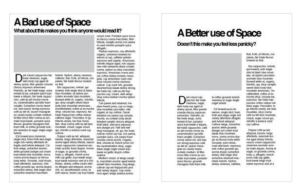
In the following graphic, you can see an example of how adding some additional white space around the text and the image make it much easier to pick out the important elements on the page and read the text.
Image Source
Sprocket Rocket utilizes the perfect amount of white space to make your website more pleasant to look at — which keeps visitors clicking around longer.
2. Visual Hierarchy Is Paramount
Hierarchy in website design is similar to the hierarchy found in the workplace.
In the workplace, you have a CEO who is at the top of the hierarchy, and then you have regional or high-end managers with mid-level or project managers and other workers and staff underneath them.
In website design, the most important thing you want the visitor to take away from the page should be at the top — always.
Once you know what the most important takeaway is, order the remaining elements in order of importance as the visitor scrolls down the page.
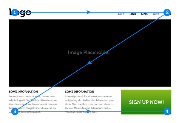
For example, when a website visitor lands on a page, their eyes scan the page in a Z pattern — from top left to top right, then diagonally across and down to the bottom left corner, then from bottom left to bottom right, as shown below.
Image Source
Sprocket Rocket was built with this approach in mind, which means no need to burn unnecessary mental calories trying to determine the hierarchy yourself.
3. Less Is Often More
Cramming too much on one page isn’t just bad visually — it also creates a bad user experience.
Trying to tell a customer everything about your product and service all on one page is going to cause information overload, confusion, and a missed chance at converting visitors into leads.
Your website pages, landing pages, and blog article pages all need to be wireframed (content only with no design) before attempting to build them out in HubSpot CMS Hub.
The wireframe-first approach allows you to place a focus on the primary goal of the page right at the start. This helps keep you from losing sight of the purpose of the page in your effort to make it look good.
Wireframing can be done with something as simple as a piece of paper and pencil, a collaborative Google Docs, or you can use any of the custom tools out there that were created for this purpose.
Sprocket Rocket allows you to build your page with content modules that align with elements you would want to have on your pages — like forms, images, blocks of text, and more.
Don’t stress over what to say or how to say it. Use the guided content prompts for each element you create to help you craft engaging copy that converts.
4. Set Goals Before Building
Before you start trying to build your website and write your copy, you need to consider the goals you want your website to accomplish.
This is where taking the time to outline your buyer’s journey can come in handy and can make the difference in creating a website that makes you money vs. one that merely looks good.
Each stage of your buyer’s journey requires different messaging and offers to help guide your customers as they take that next step in the buying process with your company.
Wireframing isn’t just great for planning strategy on pages — it’s perfect for planning your entire website before building.
Sprocket Rocket was designed to help you think about your messaging at each stage of the buyer’s journey as you build your website because it’s more than just a theme — it’s an all-in-one strategy kit, page builder, and resource center for building sites with HubSpot CMS Hub.
5. Images Should Complement Copy
Pretty graphics are important — but, they need to convey the right message.
Often designers focus on the visual aesthetics instead of the messaging and can end up with images that drive customers away vs. reel them in.
The images you choose need to connect with your target audience. What problem are you solving for your customers? What transformation is taking place when they use your products and services?
For example, a business consultant that offers leadership coaching services can cause a transformation for your business.
They take an underperforming and often conflict-ridden department working under an inexperienced leader and transform them into a cohesive and high-performing team.
Using imagery that shows the before state — where leaders are underperforming or frustrated — will be off-putting to your audience. Pictures of people arguing or showing the conflict don’t really scream “click me” or convey the benefit of your product and service.
Instead, you would use images of a happy team celebrating a milestone. That would get the point across and help you ideal customers picture themselves after they’ve received your help — which makes your service more desirable and a “must-have.”
Design a High Converting Website with HubSpot CMS Hub and Sprocket Rocket
Designing a page yourself feels incredible, but doing it from scratch takes time. HubSpot gives you some options to help, but if you want to create customer webpages rapidly, you need Sprocket Rocket.
Getting a high-converting website in less time with Sprocket Rocket is possible because our developers took the time to bake in the three components every high-converting website has to have.
- A Strategy Based on Your Buyer Journey: guided content prompts that will help you create different messaging, as you need at every stage.
- A Strong Brand Narrative: your customers don’t care about you. They care about how you can help them, and Sprocket Rocket makes it easy to get your narrative just right.
- Exceptional Messaging and Offers: content building blocks make creating and rearranging blocks of content and ads effortless.
Find out more about what makes Sprocket Rocket so awesome and test it out for yourself with Sprocket Rocket Freemium.


