Lead generation is the engine that drives our marketing efforts. Calls-to-Action (CTA) are the oil that keeps that engine running smoothly. CTAs are critical for turning visitors into leads, but the right tools and tactics are required to effectively execute.
HubSpot is one such tool.
Having a powerful marketing automation platform allows you to be more effective in your marketing, CTAs included. It doesn't simply make what you are doing better, it allows you to do things that you would not be able to do otherwise.
Using the HubSpot CTA tool, you can:
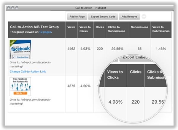
- Monitor and measure the performance of each CTA and it's location
- Easily a/b test everything from the offer to the color of the button
- Utilize "smart" CTAs that can dynamically change based on the visitors interest, industry, or stage in your funnel
- Quickly and easily create CTAs and attach them to related webpages and content
8 Best Practices for Using HubSpot CTAs
As you develop your CTAs in HubSpot, it's important to keep the following best practices in mind:
1. Be Actionable & Benefit-Driven
Forget "submit," use verbs and focus on what you are offering them i.e., "Click Here for your White Paper," "Subscribe to our Newsletter," "Get Your Free Copy Now."
If appropriate, you can get even more specific in your messaging. Basecamp uses a large, blue button centered on the page that states "Give Basecamp a try - it's free for 60 days."

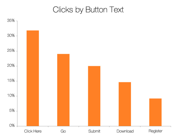
Bonus Tip: Avoid overused action words like "Download," they have been found not to be as successful as more interesting phrases.

2. Be Visually Appealing
The visual aspects include some of the most critical components of your CTA:

- Color needs to be bright and contrast from the colors on the rest of the page
- Size should be large enough that it is prominent on the page, but not overpowering - don't oversell
- Button needs to be bold and "clickable," make your readers want to click on it
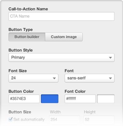
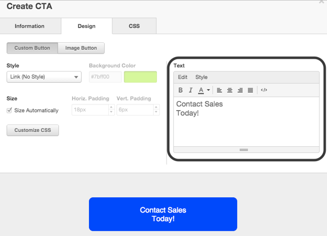
The HubSpot CTA builder makes is easy to quickly change the size, color, and language on your buttons. Ultimately, you want to ensure the button is easy to find and enticing.
3. Be Clear and Succinct
Tell the visitor exactly what they are getting. Avoid passive language or vague wording; be brief but clear in what you are offering.
When a lead understands exactly what they will be getting, they are more likely to provide you with their information in exchange for it.

4. Offer Must Match Deliverable
At the point that your lead receives the offer, you already have their information. But if what you provided doesn't match what they expected, you will lose credibility and that lead will lose trust with your brand.
This doesn't just mean that you need to give them a white paper if you offered a white paper, or a video if you offered a video, but that your verbiage and requirements match the quality of what you are providing.
Give the lead exactly what they are looking for, and don't over promise and under-deliver.
5. Location, Location, Location
The placement is a key element of whether your CTA is successful or not. The goal is to turn your visitors into leads, so include a CTA on all of your pages that see the most new traffic, such as a blog.
The actual placement on the page itself is equally important. You want to have one CTA above the fold, but you also want to have one below the fold, if your content goes further down the page. Include multiple CTAs for the same offer, placed in various locations such as the side bar, at the top of the post, right above the comments, etc.
For bonus points, analyze the effectiveness of the various CTAs on a single page to get a better understanding of how placement affects click through rates.
6. Limit Each Page's Offers
Each page that you are including a CTA on should ideally focus on one offer, two at the most. The primary CTA is your more compelling and relevant one; a secondary CTA is most effective when someone isn't quite ready to take the next step in your primary offer.
If you do include two CTAs, make sure they do not compete with each other and that your secondary offer takes a "backseat" to your primary one.
7. Relevancy
Make sure the CTA matches the page it is on. Whether it is a product page, company page, or blog article, your primary (and if needed, secondary) CTAs need to match the subject matter of the page it is on and the persona that is aimed at.
This is one of the powerful features of HubSpots CTA tool; "smart" CTAs will dynamically change based on the visitor, so you can be assured that the offer will always be something interesting and relevant to them.
8. A/B Test
Finally, make sure you are A/B testing everything. Not all at once, of course. Proper testing involves changing one element at a time and then measuring the results.
HubSpot makes it very easy to clone CTAs and then change a single piece, like the color or the button verbiage. And you can trust that HubSpot knows what they are doing, they "eat their own dog food"; in fact, one CTA test that involved changing their button action terms increased their conversion rates by 211%.

Make Your CTAs Work For You
Call-to-Actions area critical component of any lead generation strategy but without the proper tools, it's a daunting challenge, if not impossible. To be effective, utilize the capabilities that the HubSpot CTA builder offers along with these best practices. And with the HubSpot platform, you can actually see the performance improvement of your CTAs. Take the guesswork out of your lead generation.
Writer. Reader. Lover of naps, dogs, sunshine and ironic humor. Samantha's specialties include SEO, content marketing, and rescuing turtles in the road. Oh, and she's a #marketing engineer... with an artistic flair.