How much did you pay for your website?
Websites can range from $45 for a DIY Wordpress theme to more than $100,000 for a high-end, customized site. This is why asking someone how much they paid for their company website is usually a complete waste of time.
While they may be able to give you a numerical figure, they probably can't answer the more important question: was it worth it?
The truth is there is no hard-line cost of website design for small businesses.
In this article, we'll explore the primary factors you should consider when evaluating website quotes. Consider these four factors in your next redesign, and you can feel confident you are investing in something that will generate the results you want.
Because that's what it's really about, right? Results!
What Is The Average Cost of Website Design for Small Business?
1. Buyer's Journey vs. Brochure
You can splash up a cheap brochure website, and regardless of how little you paid for it, it's not going to be worth it. Those sites are easily destroyed by any competitor with even a little bit of sense.
Your new website should be built with the Buyer's Journey in mind, which is usually broken into three phases: Awareness, Consideration and Decision.
PHASE 1: Awareness
The prospect has become aware of a problem or desire they would like met. They are just now starting to learn more about everything associated with that tangible or intangible thing.
PHASE 2: Consideration
At this point, the prospect knows they are going to purchase this product or service. The question is ultimately who are they going to purchase it from?
PHASE 3: Decision
Finally, the prospect concludes one provider to best meet their needs, and commits to purchasing with them.
The error most businesses make is throwing up a bunch of product information on a brochure site that doesn't honor each of these unique phases. A brochure website about your company won't scare your competitors.
Conversely, a website designed with the buyer's journey in mind is a vehicle for building a relationship with each and every lead, rather than a hit and miss with a one-time advertisement.
Let's look at this more closely with an example:
Kraus Capital Management is a financial advisory firm. They offer financial planning services for employees in the telecom, military and civil service industries; business owners; professionals; and families. The firm is utilizing a brochure-style website that they may or may not have designed themselves: It looks like a standard Wordpress theme: 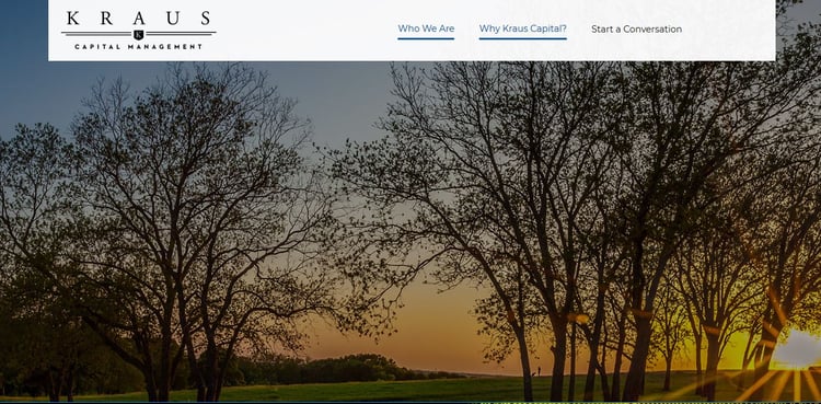
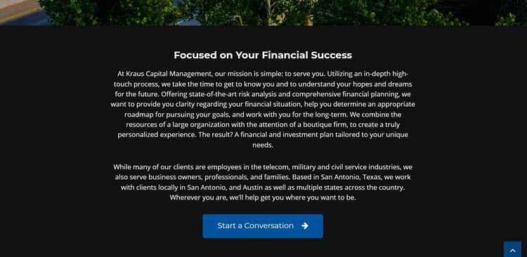 The overall design is nice, and the firm has done a great job articulating who they serve, without initially overwhelming the prospect with too much information. With that said, they are making one HUGE error: The site's first Call-to-Action is an invitation to "Start a conversation."
Considering that 99 percent of visitors are NOT ready to make a purchase the first time they visit a site, Kraus is being a bit presumptuous. Early researchers may not even know what questions they should be asking at this point. With no designed path for visitors in the awareness or consideration stages of purchase, the firm is missing out on valuable lead nurturing opportunities.
Now, let's compare that with Robinson Smith Wealth Advisors, a Lean Labs client who designed their site with the Buyer's Journey in mind: 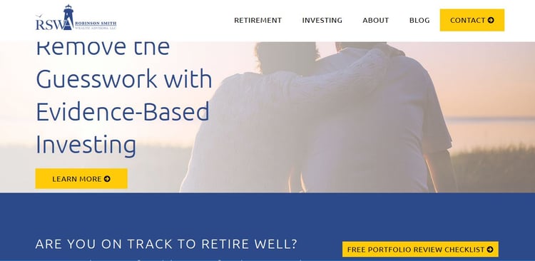
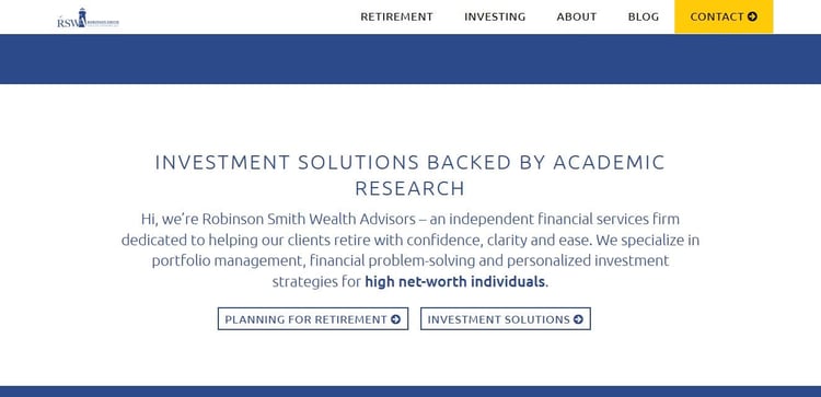
Immediately, RSWA tackles the number one dilemma most prospects have when initially contacting them: They don't feel confident they are making the best possible investment decisions for retirement. The visitor can either choose to a). Learn more about evidence-based investing or b). Download a retirement checklist, depending on which option best suites their current needs. 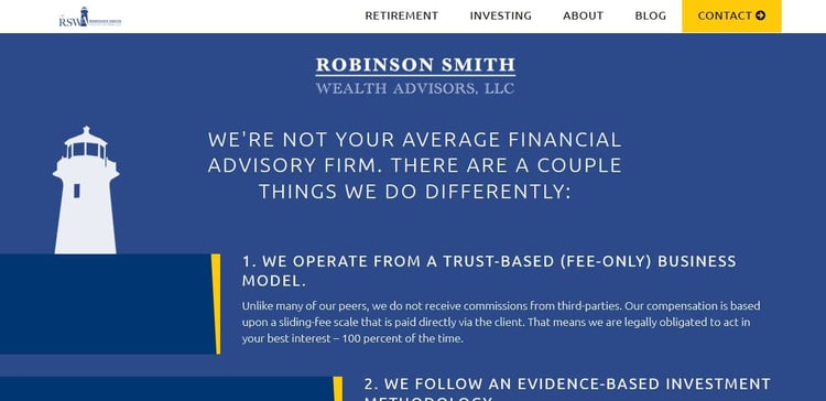
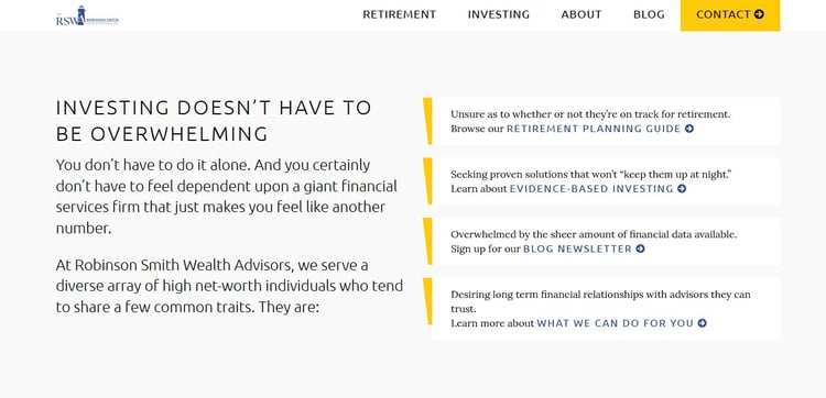 Scroll down further, and the company introduces themselves before presenting the visitor with the same two options. The site then answers the next most obvious question on visitors' minds: Why should we trust you? Finally, they provide four different options for continuing The Buyer's Journey.
After reviewing the two financial service websites, which one do you think captures more leads? As you might expect, designing with the Buyer's Journey in mind involves additional work, research and strategic planning that translates to a higher web design cost. However, it's entirely worth it for companies that want their websites to generate revenue.
2. Message is Everything
When comparing the two financial websites above, you may have noticed another differentiating factor: One focused on the visitor and the other focused on themselves.
RSWA does a fantastic job of communicating the benefits the customer can receive by utilizing their services. They also use the same language their customers would use to describe their current difficulties, questions and concerns. On high-performance websites, the copy is always about the customer, their goals and their challenges.
Conversely, most company websites are filled with messaging about themselves, their products and their features. One way to create more engaging copy is to begin by creating a Buyer Persona. A thoughtfully constructed Buyer Persona organizes the characteristics, idiosyncrasies and relevant aspects of your ideal customer onto one sheet of paper, making it easier to stay on message. If you want a customized message in addition to a design interface, expect to pay a little extra.
3. User Experience
Another factor that directly affects website cost is user experience requests:
- What experience do your customers want from your website?
- What design functionalities will be most helpful?
- What features do they expect to find?
Advanced functionality isn't always necessity, but some customers expect it.
For those brands, going beyond simple images and text, is paramount to really crushing your goals. Most businesses we come across don't require anything too crazy. However, details like an interactive map, or a mouse-hover action, can sometimes separate someone from their competitors in a beneficial way. This is probably the category where it is easiest to cut costs.
4. Conversion Opportunities
Finally, companies who want their websites to be lead-generation machines must consider the cost of conversion opportunities.
If you could take the top sales professional in your industry, and clone him so that everyone who comes into contact with them receives the same brand experience, wouldn't you want to do it? Your website is that best salesperson. Designing for conversion is about replicating that person online.
Businesses who choose to continue analyzing data points, tweak messaging and refining offers post-launch with their web design provider budget for continued improvements. Oftentimes, the smallest tweaks can generate substantially more leads, more opportunities and more sales. The best web design providers make educated guesses and continue to test their assumptions long after the site has gone live.
With that said, don't break your budget pre-launch. Save some money to accommodate updates in the months that follow -- based on data points like web page bounce rates, clickthroughs and traffic sources -- to determine what's working and what's not.
How much does it cost?
As we have shown, there is no average web design cost for small businesses. And asking how much a website design costs alone is futile. You must also ask what exactly you are getting for that cost, and what you expect to get in return.
Despite the affordability provided by DIY options, most lack the customization required for significant lead generation pipelines. Additionally, monthly DIY-providers like WIX undermine SEO strategies by hosting your site on their domain. Wouldn't you prefer the content you work so hard to create work for you?!
Alternatively, you can spend tens of thousands on a beautiful site that doesn't deliver results because it wasn't designed with the Buyer's Journey in mind. The solution: Instead of choosing a website based on price alone, consider the four factors discussed in this article and pay for results.