More than likely, you been to at least one website that made you think, "wow, this is awesome!"
But you've also been to a lot more that were just frustrating.
You see, Website Branding is about a lot more than logos and colors. Branding is more than aesthetics, and the same is true for your website.
Think about your favorite brands; their colors and logos are why you recognize them.
But that's not why you like them!
Think about your favorite websites: not the ones you've looked at for design inspiration for your brand. That's not a fair comparison. When most people are looking for websites they "like," it's almost always graphical.
I'm talking about websites you love to use!
For example, have you ever tried to navigate Apple TV app? Compare that with Netflix, and it's not even close. The Apple app is too confusing to find anything, while Netflix is, well, easy.
That's why "it just works," was one of Steve Job's best quotes - because that's how Apple felt compared to a PC.
How does your website feel to your customers?
It may be beautiful. But how does it feel?
Your website must be more than aesthetically pleasing. It must radiate your brand. It must feel like a natural extension of the DNA of your brand.
If it doesn't, it will always feel like an afterthought to the worst possible crowd: your customers.
Let's look at some of the key elements of strong website branding and explore some examples of brands that got it right!
website grader
What's Killing Your Website Conversions? Find Out Now
Use our proven conversion kit to analyze your website. Uncover what’s working so you can amplify it, pinpoint areas that need improvement, and get our expert advice on how to turn your website into your brand’s #1 salesperson.
- Diagnose your biggest website pitfalls
- Step-by-step recommendations for improvement
- Maximize visitor engagement and conversions
Thanks for submitting the form!
Why B2B Companies Need Strong Website Branding
Branding is the characteristics that give your company a personality, a voice, and unique attributes that set you apart from other companies. As it pertains to website design, great branding will effectively master a look, feel, aesthetic, and messaging that tells your customers who you are and why you deserve to work with them.
The companies that build these types of websites don’t always need a massive budget because of two reasons: they know who their customer is and they want to help them solve their problems.
Here are a few of my favorite website branding and design examples from companies that do this exceptionally well.
Essential Website Branding Elements
To guide our exploration of our list of strong website branding examples, we’ll discuss ten essential elements you need to have a strong site branding. If you can build a website that incorporates all these elements, you’ll have a site with top-tier branding.
The elements, which we’ll discuss in more detail below, are:
- Nail the User Experience
- Be Transparent About Who You Serve (And Who You Don’t)
- Build Trust with Social Proof
- Incorporate Brand Narrative and Personality
- Focus on Your Target Customers’ Pain Points
- Utilize an Easy-to-Follow Site Structure
- Employ Consistent Branding On- and Off-Site
- Illustrate a Clear Objective
- Use Visual Elements Wisely
- Engage in Continuous Improvement and Adaptation
1. Nail the User Experience
The first thing you need to master when you create your website is the user experience. To achieve this you’ll need to understand your customer and take appropriate steps to design a site that gives them exactly what they want.
Ever tried to navigate a website that feels like a maze? Frustrating, right? That's why nailing your user experience is crucial. It's not just about looking pretty; it's about feeling right.
Example: Reebok
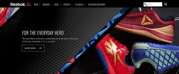
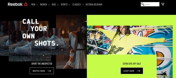
Reebok has an awesome UX with messaging and imagery that conveys two things:
- They’re a fresh, trendy company
- They want to help you be trendy, too
Their customer is someone with one goal: to feel good about themselves. They’re trying to do this by wearing awesome sneakers, whether to look more fashionable or to look more fashionable while participating in a sport. It’s about status. And Reebok understands that, so they have a website that leverages bold website content and intriguing video and images.
Tips from Reebok's Site:
- Get inside your customer's head. What do they want? What frustrates them? Listen to sales calls and read customer surveys until you truly understand.
- Design your site like you're holding your customer's hand, guiding them through the buyer journey, step-by-step.
- Test, test, and test again. A killer user experience will be seamless and bug-free.
2. Be Transparent About Who You Serve (And Who You Don’t)
No experience is universal. No brand is universal, either. By trying to simultaneously target all the markets under the sun, you all but guarantee that you’ll end up with a bland and boring site that attracts no one.
Alternately, you’ll find yourself inundated with unqualified leads that you need to waste your time sorting through to find the diamonds in the rough. Instead, you should focus on building a site that tells visitors who you are in a way that weeds out unqualified leads and attracts only your perfect customers.
Example: SprocketRocket
Sometimes, it’s so difficult to know whether or not a product, service, or platform is the right fit for you. For example, there are a lot of people who want to build a new website, fast. That’s why a big part of our branding for SprocketRocket is about working with HubSpot and our beliefs in buyer journey websites.
We want to attract someone who will purchase HubSpot (non-negotiable) and wants to increase or improve their lead generation efforts. To avoid attracting the wrong customer, we use specific messaging to explain what we are and what we’re not. We also ask qualifying questions upfront. And instead of having the visitor fill out a form with a ton of personal information, we use a series of yes or no pop-ups.
Tips from Sprocket Rocket's Site:
- Define your ideal customer. Get specific – really specific. Understand them inside and out: who they are, what they want, and how you can help.
- Use language that resonates with them (and might confuse others). Don't go overkill on jargon, but make sure you're using the terms your audience uses to discuss their needs, pains, and solutions.
- Don't be afraid to say who you're not for. It's not rude; it's refreshing.
3. Build Trust with Social Proof
In the modern market, trust is the most important - and rarest - currency. People are hesitant to engage with a product, service, or brand unless they know it works. If they’ve never worked with you before, the surest way to show them you can walk the walk is to provide credible examples of customers already crushing it with your help.
In short, your visitors are more likely to engage with your site and your brand if they see proof that others have already done so. The idea is to build trust and authority… without bragging.
Example: Baker
There isn’t a single potential customer that doesn’t ask, as soon as they learn about your offer: How do I know this will work for me?
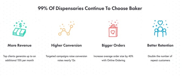
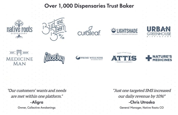
Baker, the leading CRM for the cannabis industry, answers that question with a lot of social proof and strong statistics. They show the revenue people earn using Baker, the average conversion rates customers can expect, as well as how their average order size can increase. They also share various dispensaries that use Baker and personal testimonials from some of those current customers.
As a result, any potential customer will believe that Baker is an authority in the cannabis industry that they can trust.
Tips from Baker's Site:
- Showcase real customer testimonials. The more specific, the better.
- If you've got impressive numbers, flaunt them! Share them right on your homepage.
- Use trust badges, awards, or certifications – but don't go overboard.
4. Incorporate Brand Narrative and Personality
Your company has a personality and an identity. What’s more, your brand has a story. There’s a reason you exist—you were trying to solve a problem. Guess what? Your target audience is grappling with that same problem right now. What better way to connect with them than sharing your story?
Incorporating an engaging story with authentic messaging and branded imagery is a great way to attract the right potential customers to engage with your site.
Example: Klientboost
You’ve probably been to a few websites that use fun and colorful iconography and illustrations. It’s a popular tactic in website design to make sites more engaging. But if you want to use this approach to introduce your customers to your brand, you also need to tell them a story. You can’t just throw some fun imagery up there and call it a day. You need substance, which is why I love the Klientboost website.
It’s easy to understand, very quickly, what Klientboost does (improve PPC performance) expertly aligning effective copy and vibrant images to tell their brand story. I want to work with them after coming to their website because I have a strong sense of who they are and what they’re going to help me accomplish.
Tips from Klientboost's Site:
- Craft an "About Us" page that actually tells a story.
- Infuse your brand voice into every piece of copy, from site copy to blog content to email nurture campaigns and more.
- Use imagery that reflects your brand personality, not just stock photos.
5. Focus on Your Target Customers’ Pain Points
We touched on this a little in the past bullet, but your customers are looking for sites like yours because they have a problem they need to solve. Building your site to highlight those pain points will:
- Show your target customers that you understand their plight
- Give you the opportunity to demonstrate how your brand can make their lives easier.
Example: Qualio
At the beginning of any buyer journey, a potential customer is looking to solve a problem. They’re not ready to buy, which is why companies that are aggressive about the sale and use brand-centric language alienate their target audience. They don’t care that you’re the #1 in your industry and they’re not going to respond to fluffy or vague language about what you do.
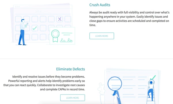
Customers don’t care. They want to know that you can help them. And Qualio, a quality management software, earns the trust of prospective customers with messaging that reflects their challenges. Since their target customer is people in quality assurance roles, they address issues such as preparing for audits and improving the quality of medical devices.
Because when one of these professionals first seeks a QMS, these are the problems they’re looking to solve. By focusing on this, Qualio positions itself as a trusted brand with a lot of expertise instead of a company trying to sell you a platform.
Tips from Qualio's Site:
- List out your customers' top 3-5 pain points. Speak to real customers, your sales team, or conduct other in-depth customer research to figure out what these are.
- Address these pain points directly on your homepage.
- Show how your product or service is the aspirin to their headache.
VIDEO INSIGHTS
Learn The 4 Pillars Of A Winning Website.
Watch the FREE video training to learn:
- The #1 marketing mistake most websites make
- Four pillars of a winning website
- A step-by-step process to apply these pillars to your site
Thanks for submitting the form!
6. Utilize an Easy-to-Follow Site Structure
Have you ever clicked onto a website, become overwhelmed with the number of graphics or menu items, then simply clicked off and looked to see if another brand could get you the information you needed in an easier, more direct manner?
Spoiler alert: You don’t want to be that website.
Instead, you want your site to be like a roadmap for your visitors: So well-laid-out that it makes it easy to find what they need in seconds.
Example: PayPal 

PayPal has a ton of competition now, from apps like Venmo and Zelle to the ability to pay using Apple Pay and Facebook. However, a lot of these sites focus on the social aspect of paying for things, which PayPal doesn’t do. In contrast, the PayPal site is lean and easy to use.
It’s a simple experience that personally, saves me a ton of time. I hop on, I log in, I deposit funds from my Etsy store, or I send money to one of my writers, and I’m done. I’m PayPal’s target customer because I don’t care about a NewsFeed that shows payments going back and forth between users (Venmo) or paying from my iPhone (Apple Pay). I want to get stuff done.
That’s why on PayPal’s site, there’s no fluff, no unnecessary bells, and whistles. It’s just a simple and straightforward experience. In my opinion, this is an excellent way for PayPal to express that they’re a secure, reliable solution without unnecessary frills.
Tips from PayPal's Site:
- Use clear, descriptive menu labels.
- Implement a logical hierarchy – put your most important items in the navigation bar, and nest anything else to avoid cluttering the UI.
7. Employ Consistent Branding On- and Off-Site
Even if your site follows the first elements to the T, there’s still a chance you’ll stumble at this final hurdle. The truth is, many of your site visitors will encounter your brand long before they make it to your website. They may see your social media channels, drive past a physical location if you have one, or encounter one of your paid ads.
The only way to ensure you’re getting the maximum benefit out of all your disparate efforts on and offline is to ensure you maintain consistent branding across all your efforts. Consider imagery, messaging, color scheme, and more. Leave customers with no doubt about whether or not they’re interacting with your brand, regardless of where they find you.
Example: Planet Fitness


Planet Fitness nails branding consistency to the point that their color scheme might be one of the most recognizable in modern advertising and marketing. But Planet Fitness nails their consistency beyond just their brand color palette. Let’s take a look at how.
Planet Fitness’s target customer is the Average Joe looking to adopt healthier habits. They position themselves against more “intimidating” gyms, presenting themselves as friendly, approachable, and accessible.
Note the consistency between the hashtag in their Twitter bio and the slogan on their website homepage. The voice also matches their homepage copy and Twitter profile, using slang terms like “fitacular” and “glow.”
In short, if a customer encounters anything from a print ad to a Tweet to the website homepage, they will undoubtedly know that they are engaging with Planet Fitness.
Tips from Planet Fitness's Site:
- Create a brand style guide and stick to it religiously.
- Ensure your social media profiles match your website's look and feel.
- Train your team on your brand voice to maintain consistency in all communications.
8. Illustrate a Clear Objective
Launching a website without a clear objective is hopping in the car for a road trip without deciding on a destination. Every visitor who arrives on your site should be able to see where you're leading them.
Does your website have a clear purpose? Are you communicating that purpose clearly and simply to your visitors? If not, you are missing a major opportunity and creating unnecessary friction in your buyer journey.
Example: Evernote

Evernote's homepage leaves no doubt about their purpose and the opportunity they present to their customers (organizing their lives). What's more, it's obvious what action the visitor needs to take to enjoy that benefit.
Clear CTAs guide site visitors to start their free Evernote account and get started using their notetaking application today. The homepage alone has five separate, clear CTAs all featuring that same text, giving site visitors a clear next step no matter where they are on the page.
Tips from Evernote's Site:
- Define your home page's primary objective (usually it's to generate a click... but a click to WHERE?)
- Make your main call-to-action prominent and impossible to miss.
- Ensure every link contributes to your main objective in some way.
9. Use Visual Elements Wisely
Of course, branding is about more than aesthetics and design, but visuals are a critical component of any successful website.
Visual elements are the spice in your website branding curry. Use too little, and it's bland. Use too much, and it's overwhelming. The key is finding that perfect balance that makes your brand pop.
Example: HubSpot

HubSpot's use of color is a thing of beauty. Their signature orange is everywhere, but it's not overpowering. Instead of throwing it into visitors' faces, instead their team uses their signature color palette as a thread that ties all their site pages together.
Their visuals all also follow the same style, mimicking the user environment of their tools in a way that introduces site visitors to their product and helps keep branding consistent across all touchpoints.
10. Engage in Continuous Improvement and Adaptation
Last but not least, one of the most critical elements of strong website branding is continuous improvement. Like any other marketing element, your website isn't a "set it and forget it" solution.
A successful site is a living element. Your team should continually test and iterate upon various pages and site features. Trends, user expectations, algorithms, and technology are constantly updating. If you want your site to succeed, you need to be prepared to keep up with the changes!
Example: Lean Labs

At Lean Labs, we're always tinkering with our own site. We use it as a testing ground for new ideas before rolling them out to clients. At the time of writing this post, we are currently exploring testing new copy in the navigation bar, exploring a new header for our hero section on the homepage, and launching an entirely new footer site-wide.
Change is the only constant! If you want to keep your site relevant and make it a traffic magnet long-term, you need to be prepared to make adjustments over time.
Tips from Lean Labs' Site:
- Regularly review your analytics to see what's working (and what's not).
- A/B text different elements to optimize performance over time.
- Stay up-to-date with web design trends... but don't chase every shiny new thing.
How to Leverage Amazing Website Branding to Build a High-Converting Site
Know your customer. It’s common advice that I guarantee you’ve heard. You’re thinking that’s great, but how does that turn into a high-converting website?
In my experience, it’s with an in-depth website strategy and a strong investment in website content. You need to fall in love with your customer’s problems and identify when they buy, why they buy, and why they won’t buy from you. You need to tap into their fears and motivations.
Our 4 Pillars of a Winning Website training resource is exactly what you need to transform your website into a conversion machine. This training will help you craft a highly compelling buyer journey, develop stronger content, and build a more intuitive, natural site flow.
Check out the free training resource and start leveling up your site today!


![10 Elements of Strong Website Branding [with Examples]](https://www.lean-labs.com/hs-fs/hubfs/lean-labs-growth-marketing-A004-red.png?width=600&height=315&name=lean-labs-growth-marketing-A004-red.png)
