Lead generation is a crucial component of any marketing strategy. Across industries, teams struggle to convert leads, with the average conversion rate for landing pages lingering around 2.35%. However, despite the low average, some marketers see conversions at nearly two or three times that rate.
How do they do it, and is it possible to replicate their process? Yes, it's possible. With a few best practices, a substantial offer, and HubSpot, you can work to boost your conversion rates. In this article, we'll walk through specific actions to take to improve conversions from your HubSpot landing page, using all of the features HubSpot has to offer.
Why Your HubSpot Landing Page Won't Convert
First, let's touch on the reasons your landing pages may not be converting. There are a few common issues that lead to poor landing page performance, which include:
- Multiple offers. Nearly 48% of landing pages have more than one offer, which can be distracting for visitors. It's best to focus on one offer per page.
- Poorly written copy. Your copy needs to hook and clearly explain your offer to a visitor. If it does not, poor landing page copy can discourage your lead from converting.
- Long forms. Marketers have reported that extended forms that ask for too much information upfront can result in up to a 52% drop in conversion.
- Ineffective images. Poor imagery can confuse visitors, while the selection and proper placement of more intriguing photography or illustrations can result in a 550% increase in conversions.
- Not mobile friendly. A lot of landing pages are still not optimized for mobile devices. By 2019, marketers expect that nearly 72% of all U.S. digital ad spending will be on mobile advertising. As a result, optimizing landing pages for mobile needs to be a top priority.
- Low engagement. Only .25% of PPC landing pages include a video. By avoiding video, a lot of teams miss an opportunity to improve engagement.
If you can apply any of those missteps to your landing pages, it's time for a serious refresh. There's a variety of methods to drive better performance for every aspect of a landing page, such as:
- What you're asking from the customer
- The messaging you include
- The visuals and overall UX
- Whether or not you're optimizing based on performance
After improving these core elements of your landing pages, you will see incremental improvement over a period.
Step #1. An Exceptional Ask
On every landing page, you're asking a potential customer to take time out of their day to take action. If you're trying to persuade a lead to convert on a long form, for a boring offer, your conversion rates will tank. You want something persuasive that's sure to attract potential customers. You can refine your ask with:
A Strong Offer
A genuinely fantastic offer is something buzzworthy. You want to present something that's irresistible to your ideal customer. A lot of popular ones include:
- An ebook or guide
- A free consultation
- A free trial (14 or 30 Days, usually)
- A free scan or report
The one thing all of these offers have in common, however, is that everyone uses them. Even if your offer is typical for your industry, it's essential to find a way to put an exciting spin on it.
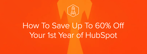
Here at Lean Labs, we use a variety of offers. One of our best is our HubSpot Savings Guide which shows our leads how they can save up to 60% off HubSpot. It's a compelling offer because it provides real value to our ideal customer.
A Concise Smart Form
Shorter forms can boost your conversion rates by nearly 160%. Why? Because they're low risk, and when a new visitor lands on an offer page, they're not going to trust your brand immediately. If you ask them to fill in 10-20 form fields, they could get scared off.
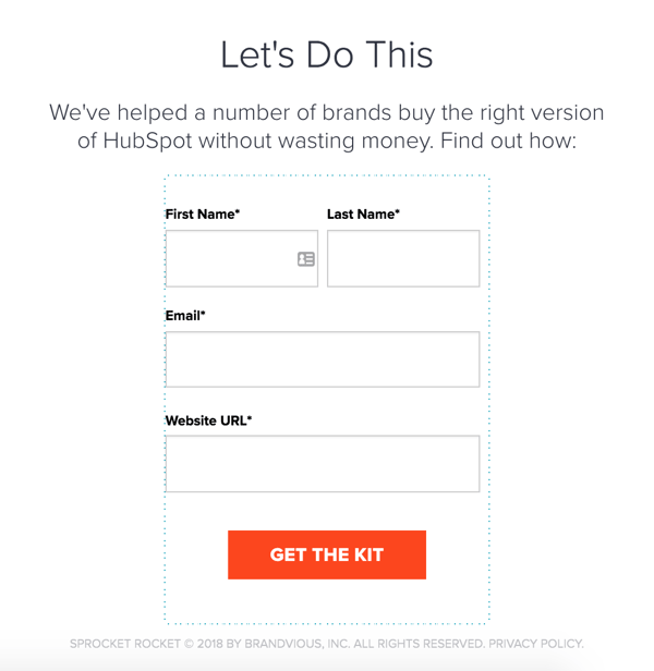
Using HubSpot, you can keep the form short while getting all of the information you need. HubSpot's smart forms allow you to queue additional fields. For instance, the first time a new visitor hits our Savings Offer page, they'll see this:

The next time that user visits and fills out a form, different questions will be asked. As a result, this "smart" shorter form collects data from users over a period, instead of asking for everything we want to know up front.
A Plan To Promote
You shouldn't expect your landing page to convert if you're not promoting it, or incorporating it into an overall inbound or digital marketing strategy. A few ideas for promotion could be:
- PPC or paid campaigns targeting various demographics of your ideal customer
- Linking the landing page in marketing emails and workflows
- Posting it in relevant forums such as Reddit and Quora
- Boosting it in posts on Twitter and Facebook or even Instagram
- Linking to it during ongoing Twitter conversations
- Sharing it with sites that offer free resources to your ideal customer
The goal is to get more mileage from your landing pages. Don't forget to use a tracking URL for anything you build or share outside of HubSpot.
#2. A Compelling Message
Exceptional landing page messaging starts with a strategy. We take cues from HubSpot examples for inspiration and also use tools such as Grammarly and Hemingway Editor to ensure our copy shines. Take your time and develop strategic language that reinforces the value of your offer, and include:
A Low To Medium Competitive Keyword
Even landing pages for paid search campaigns should target a keyword. There are a few ways to conduct keyword research for your landing page with HubSpot. You can use your buyer personas or HubSpot's topic clusters to generate ideas. There's also the keyword planner tool, which can help you brainstorm.
A Headline That Provides Context
The headline on your landing page should be catchy and to the point. You want to remind the visitor why they're there. In the header of our Savings Offer landing page, we focus on the download, which is a guide that shows how to save up to 60% off HubSpot.

If you're not the strongest writer, there are a few headline formulas out there that can help. Kissmetrics has a great list of awesome headline copywriting examples. You should make sure it's in title case or AP Style on the actual LP, and include your targeted keyword in the text.
Clarity About The Offer
We match all of our landing page headlines to the call-to-action, or CTA. Rather than using generic language like "Download Now," we'll say "Get The Savings Strategy" to remind the customer of what they're receiving.

Including the offer in the headline also lets customers know they came to the right place. Users can switch back and forth between tabs or get distracted, then return to the landing page later. For example, if you use the language "Free Demo" on your ad, your landing pages should have "Free Demo" on the headline or the CTA.
A Compelling Value Proposition
You can add context to your landing page and your brand with your UVP, or unique value proposition. The UVP should describe (in about a sentence) what sets your brand apart from the rest, which will help target new leads that won't be familiar with your service.
Here are 25 companies with memorable, descriptive UVPs. Although many of these examples are of the home page, your UVP should be carried over and incorporated into landing pages as well.
Simple, Skimmable Copy
You want to craft copy that clearly explains the value of your product or service (show, don't tell.) So throughout your landing page copy, be sure to:
- Avoid fluffy language or industry buzzwords
- Find ways to differentiate yourself from competitors
- Decrease amount of long paragraphs or walls of text
- Combine features and benefits to avoid seeming too self-promotional
Use bullet points, sub-headers, lists, or modules to help break up the page. As a best practice, we structure the framework of our landing pages before writing. We sketch out what each section needs to communicate, putting us in the best possible position to use our landing page real estate wisely.
For additional guidance, check out this post from Kickoff Labs, with Ten Examples That Teach You How to Write Remarkable Landing Page Copy. Unbounce also did a great piece about crafting LP copy, Unbounce Academy: 5.1: Skimmable Copy.
A CTA That Inspires Action
A vague call to action is a conversion killer. That's why brands have increasingly phased out copy such as "Get Started" or "Submit." Your CTA should communicate the next step, such as a phone call, a download, or adding the visitor to an email list.
When you're using HubSpot, there's a lot of ways to customize a CTA, such as with your brand colors and preferred font size. HubSpot offers a lot of additional guidance on designing CTAs with 31 Call-to-Action Examples You Can't Help But Click.
2-3 Short Testimonials or Reviews From Happy Customers
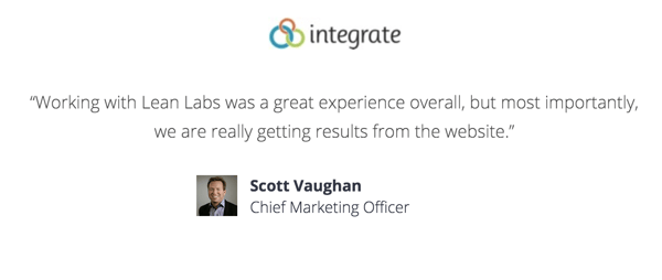
Reviews boost credibility, so we add a slider to some of our HubSpot landing and website pages with quotes from previous clients.

It's best to keep the reviews short and simple. If you have to cut down or reformat a review significantly, make sure you run the revision by the person who submitted it. If you haven't collected any reviews or testimonials, consider using Twitter Cards with positive feedback. Depending on your offer, you can also check product review sites such as Capterra or TrustRadius to see if there are any reviews posted.
#3. Visuals and UX
For landing pages, don't just post a couple of stock photos and call it a day. Since 90% of the information transmitted to our brain is visual, using images that provide context and guide your visitor through your landing page will be helpful. Illustrations, unique photography, .gifs, and video are all mediums that you can use to build trust and snag your reader's attention.
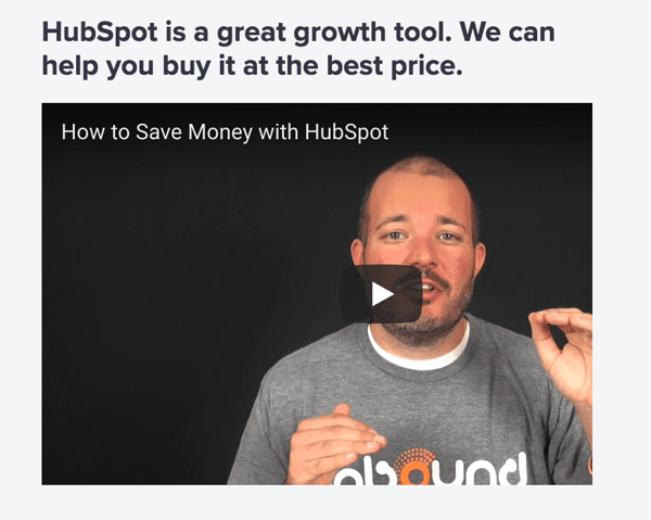
We tend to mix video and images, such as this video of our Founder, Kevin Barber, discussing our offer.

Here are all of the other visual aspects we incorporate into our pages:
A Streamlined Look
The best landing pages are minimal and easy to navigate. There are various LP templates available in the HubSpot Marketplace that we prefer, such as Symphony by Web Canopy. We also utilize SprocketRocket to prototype our landing pages, then draft them into HubSpot. From there, our designers tweak and adjust the look to match our branding.
No Main Navigation
As it stands, only 16% of all landing pages are free of navigation bars. The goal of your landing page is to get the user to convert, and not to go anywhere else. While it seems like a good idea to have the navigation on a landing page, removing external links can improve conversion rate for landing pages. Visitors will focus on the message on the landing page, instead of getting distracted and going elsewhere.
2-3 Client Logos
A study conducted by Accenture, Seeing Beyond The Loyalty Illusion, summarized one consistent fact about customers. To buy from you, they need to trust you. From the very beginning of your interaction with a new lead, you need to show them that you're a trustworthy brand.
You can demonstrate this with a few client logos. Find updated, high-resolution logos to include on the landing pages for the companies and organizations you've successfully worked with in the past.
Social Sharing Buttons
Social sharing buttons are a great way to reach even more customers. Using HubSpot, you can add a social sharing module to your landing page, making it possible for visitors to share the link on their favorite social channel. HubSpot will track and attribute incoming traffic automatically, so you can drive even more traffic back to your landing page and identify the sources.
Optimized For Mobile
Last year, about 52% of global web traffic came from mobile devices. With mobile driving so much traffic, it's crucial to make any buttons or CTAs large enough to click from a touchscreen phone. You should also use a mobile app testing platform, such as Browserstack, to QC pages before launch.
HubSpot automatically optimizes landing pages for mobile, so a lot of this work is already done. If you want to double check your landing pages even further, Unbounce wrote a great article about how best practices can change when you're dealing with mobile-responsive landing pages.
Optimized For SEO
Even on conversion pages, you should optimize for SEO. As a best practice, try to strike a strategic balance of SEO and conversion. Rand Fishkin of SparkToro did a great Whiteboard Friday session on this, Should My Landing Page Be SEO-Focused, Conversion-Focused, or Both?
A Thank You Page
Every landing page should have a corresponding thank you page. With a thank you page, you can communicate next steps, and provides additional context about an offer. A thank you page should include:
- Any actions they need to take to obtain the offer
- Information about how they will receive the offer if it's a file (best practice is email)
- Additional related content, such as blog posts
- A warm sentiment (actually thank them in your messaging)
- Social sharing buttons
- A video/image that relates to the offer
- Your website's main navigation
You should not optimize thank you pages for SEO, so leads that haven't gone through your landing page cannot find the offer.
A Follow-Up Email
After a lead signs up for an offer, you should also trigger an email. The email can include a link to the offer if it's a file. If the user is signing up for a demo, workshop, or free trial, the email can communicate additional details about that. There are a few things that every follow-up email should include:
- A link to your offer (don't attach it if it's a file)
- A link to a landing page to set up a demo or consultation (depending on the offer)
- Access to their trial (depending on the offer)
- A personalization token with their name (if it's known)
- The company's contact information (address and phone number)
- A secondary piece of content or related offer
According to HubSpot research, a follow-up or "thank you" email can generate even more engagement from a lead that's already demonstrated interest.
#4. Reporting and Tracking
One of the biggest headaches for landing pages can be reporting and attributing leads. With HubSpot, you can use the data from reports to improve your landing pages. There's a whole story to be told in data that could be crucial for future optimizations. For all of our landing pages, we include:
A Conversion Goal
Every landing page should correlate to an overall conversion goal, or such as a monthly conversion rate you want to hit, or amount of leads you want to convert. These goals should be clear and specific.
Consistent A/B Testing
With HubSpot's optimization and reporting, you can run a split test without having to create a new landing page. Try running one specific test at a time, and decide on the relevance before testing. When it comes to selecting a goal for your test, HubSpot has a great checklist for running A/B tests.
A Tracking URL
Any landing pages used outside of HubSpot should include a tracking URL. The tracking URL will record and track critical information such as the source, the campaign, etc. Otherwise, it'll be confusing to understand which pages, campaigns, and ads are driving leads.
An Attribution Report
You can set up an attribution report to see which channels that are providing the most conversions. The information found in an attribution report can help you identify top performing channels. From there, you can shift strategies and budget to ensure you have the best chance at driving conversions. You should conduct regular reporting for your landing pages, which you can consistently do using HubSpot.
Another option for tracking the source of incoming leads is a HubSpot/Slack integration. Using Zapier, incoming leads populate in a Slack channel, notifying your entire sales team.
The Top Contributors of Landing Page Performance
A high performing landing page can provide tremendous value for a brand. With the right landing pages, you can accumulate qualified leads and generate interest around your offers. With HubSpot, you can create the landing pages that can help you make a real impact with your digital advertising efforts. However, if you’re struggling to establish an overarching marketing strategy or setting goals, it can be challenging to develop and deploy these pages.
Outlining a robust marketing strategy and identifying goals is the first step to success. Otherwise, it will be difficult to track and measure your performance over a period. We have a free tool, Web Design and Marketing Goal Setting Guide, that can help you set meaningful marketing goals and objectives. In this interactive workbook, you can create your three-year revenue goals and calculate the KPIs needed to achieve these goals.


