Are you struggling to get conversions out of your website?
A lot of marketers do.
It could be that your landing pages lack the punch they need to get visitors over the hurdle to the next step in the buyer's journey.
If you can't find a message that resonates with your audience and moves them to action, it's only a matter of time before you lose big.
Take these five marketing psychology tips and compare them with your landing pages to see if you're maximizing conversions with your offers.
5 Marketing Psychology Tips To Level Up Your Landing Pages
Converting visitors into leads and leads into customers is the primary purpose of your website. So, naturally, you want to do everything you can to increase landing page conversion rates. The following marketing psychology tips with landing page examples will give you some great ideas to test on your own website.
1. Don't Overdo It (The Reactance Effect)
According to Coglode, pushing people too hard by pulling too many psychological levers at once can have a negative effect.
Nudging people too hard using overly-assertive language or forcing people to make choices that don't feel natural may trigger reactance. In response, people may do the very opposite of what you were intending in order to restore their freedom.
If you use every psychological tip in this post on the same landing page, you'll run people off. They'll feel manipulated.
In other words, the first rule of psychological tips is, don't use them too much!
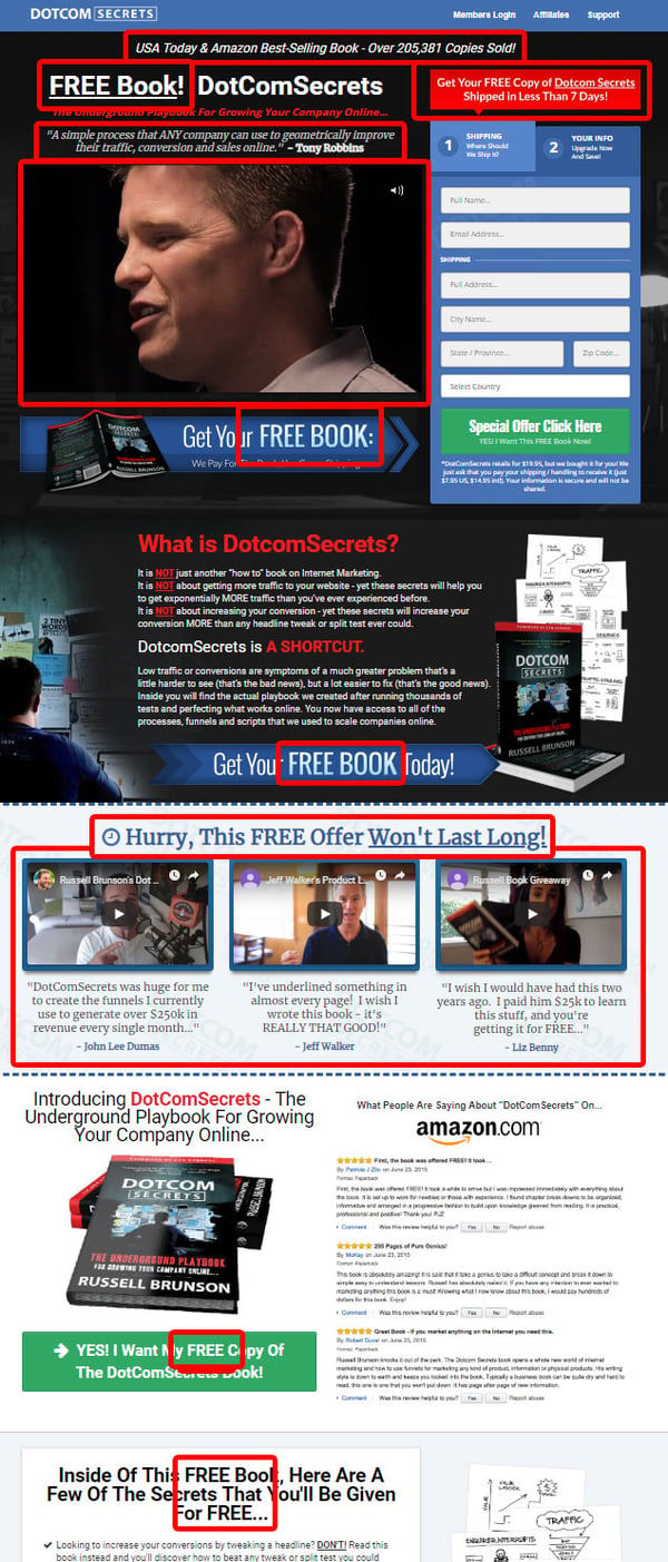
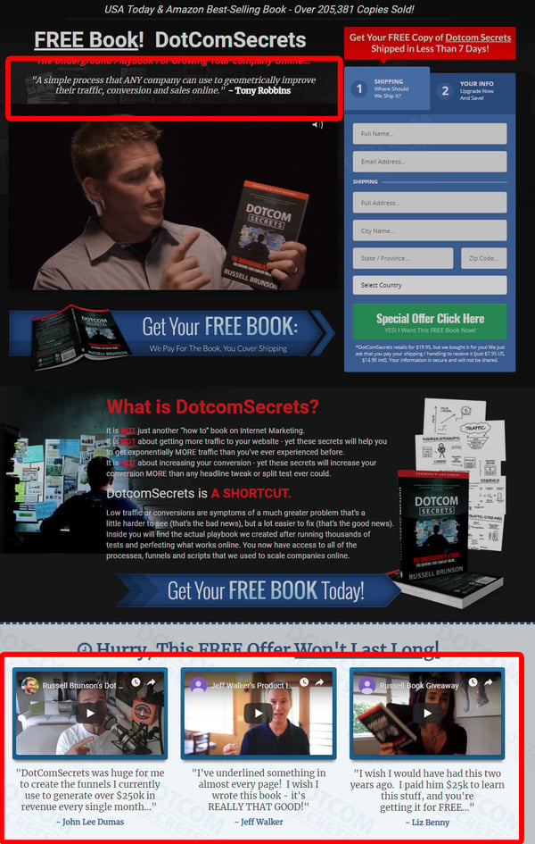
As an example of the Reactance Effect on a landing page, check out Russell Brunson's page for his Dotcom Secrets book. I'm a fan of Brunson's book and methodology, but this landing page may cross the line and nudge too hard. He uses several of the psychology tips we'll cover later in this post.
Note that while Brunson uses the word FREE in all caps seven times on the page, the fine print at the bottom of the form reveals that the visitor will have to pay $7.95 for shipping and handling. So, it really isn't free, which may turn people off.
While it's tempting to pull out every trick in your bag, the cumulative effect may overwhelm the visitor to the point of a negative response. If you have a landing page which you suspect may be triggering the Reactance Effect, set up a split test with a scaled-back version to see if you are pushing too hard.
2. Give Some, Don't Just Take (The Reciprocity Effect)
In his book, Influence, Robert Cialdani says that when you give something first, the recipient is more likely to give something in return.
"The first universal Principle of Influence is Reciprocity. Simply put, people are obliged to give back to others the form of a behavior, gift, or service that they have received first." - Robert Cialdani
Cialdani goes on to say give a couple more specific tips on how to make the reciprocity effect stronger. "The key to using the Principle of Reciprocity is to be the first to give and to ensure that what you give is personalized and unexpected."
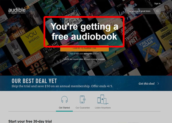
One great example of the Reciprocity Effect on a landing page is Audible's free audiobook.
This is a free trial landing page, but you get to keep the audiobook forever. This is a powerful tool that Amazon uses (Audible is an Amazon company) on their book pages. You'll often see an option to "Get this audiobook for free!" along with other purchasing options.
So, what word could you put at the end of "You're getting a free __" on your landing pages?
RELATED READING: How to Write Landing Page Copy that Increases Lead Conversion
3. Highlight the Hurt (The Pain Avoidance Effect)
In their Landing Page Optimization Guide, Quicksprout illustrates just how powerful fear is as a motivator. They cite a test by United Agencies West on which message moved more people to action. The following two subject lines were matched up head to head.
The first subject line, which spoke to a specific bad outcome, was more motivational than the second, with a 65% higher conversion rate. They concluded that readers saw the possibility of their own homes being damaged by reading the first subject line and that fear made them take action.
Let's look at a couple of examples of the pain avoidance effect used in landing pages.
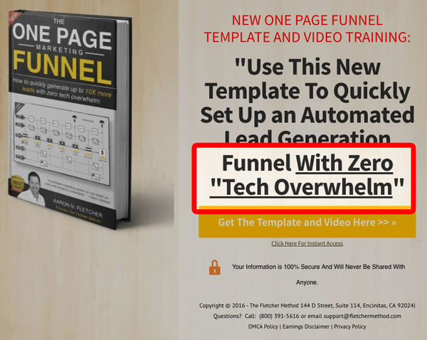
Aaron Fletcher taps into the pain of "tech overwhelm" in his landing page for the One Page Marketing Funnel. Notice the use of underline to highlight the hurt he can help you avoid.
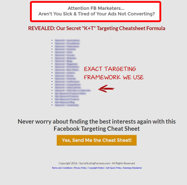
At the very top of this landing page, Social Scaling Formula says they can help you avoid the pain of Facebook ads that don't convert.
You can use this technique on almost any landing page. We tend to focus on the end benefits and state them positively, but you can test landing page variants that highlight the hurt your offer can help your prospects avoid to see which performs best.
4. Use an Attractive Character (The Liking Effect)
According to DigitalMarketer, the Liking Effect means that "We are more likely to say yes to a request if we feel connected to the person making it."
This is a similar concept to what Russell Brunson calls the "Attractive Character" in his book Dotcom Secrets. By attractive, Brunson means not necessarily a good-looking person, but someone who is relatable.
The idea here is to put a face on your company (usually a likable one). Think of Subway's Jared (before the bad stuff happened).
Let's look at a couple of examples of the Liking Effect used on landing pages.
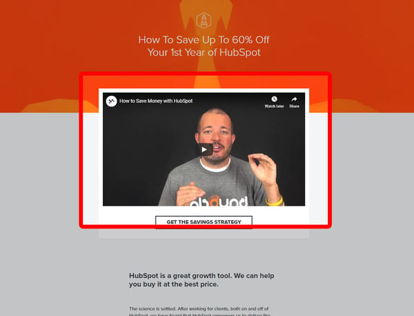
We use videos on a lot of our landing pages. On this page, Kevin, our founder, introduces our HubSpot Savings Guide offer.
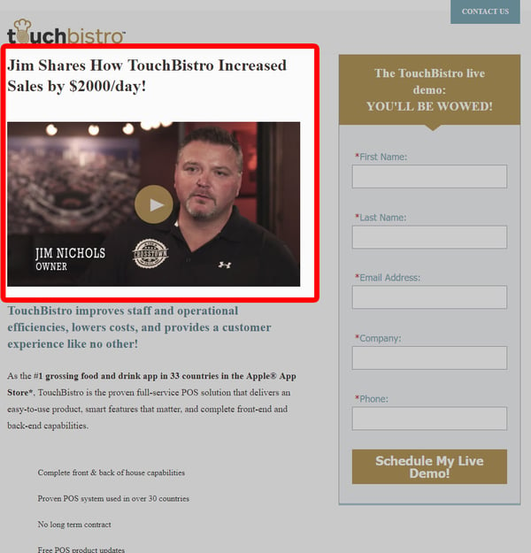
The marketers at TouchBistro have done a great job here with the Attractive Character concept by using one of their customers in a video for their live demo landing page. Notice that they don't even use Jim's last name in the headline. The use of the first name makes Jim feel like a friend.
Who can you use as an attractive character on your landing pages? This could be the founder, an employee, or a customer.
RELATED READING: The Pros and Cons of Putting a Marketing Video on Your Website or Landing Pages
5. Establish Authority (The Authority Effect)
We're hard-wired to respond to authority. From an early age, we learn to lean on the knowledge and experience of authority figures such as parents or teachers.
According to Therese Fessenden of Nielsen Norman Group, there are two reasons we defer to authority figures when making decisions.
The implicit assumption is that those in positions of authority may wield greater wisdom and power, and therefore, complying with them will lead to a favorable result.
As adults, we tend to look toward successful individuals as authority figures. If people are successful, we reason, they're smart. They have an edge over everyone else. We listen to them to them so we'll be successful too.
Let's look at a couple of examples of landing pages which use the Authority Effect well.
Russell Brunson leverages the power of authority in two prominent places on his landing page. At the top, he uses a quote from Tony Robbins and follows with three video and text testimonials from three individuals well-known in the digital marketing industry.
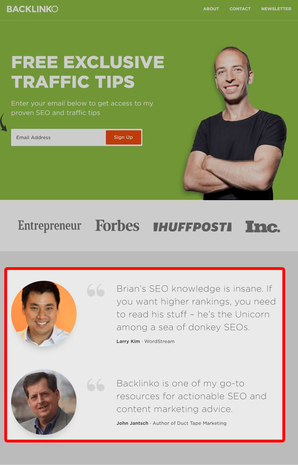
Brian Dean doesn't shy away from name dropping in his traffic tips landing page. Larry Kim and John Jantsch are recognizable names for Brian's audience, so he displays their quotes in font as big as the headline. Brian also uses logos from some of the well-known publications which he's been cited in, which is another way of using the Authority Effect.
Do you have connections with any well-known names in your industry? Reach out and see if you can get a quote.
Are You Getting the Most from Your Landing Pages?
As you can see, there are several ways that you can use psychology principles to build a landing page design that maximizes conversions. Test some of your high-traffic landing pages with these tips to make sure that you're not leaving money on the table.
We believe strongly that web design shouldn't be a one-time set-it-and-forget-it thing. Today's top marketers understand that your website should be constantly evolving to reach more of your audience and convert more of them into customers.
We've outlined the iterative web design approach we use to 10x our clients' visitors, leads, and opportunities in our free eBook, 6 Reasons to Adopt Growth Driven Design. If you're interested in learning how to make your site a high-performing lead-generating machine, this eBook is for you.
It really is free. No shipping and handling!

