There are a million ways to make a call-to-action. But how do you create a call to action that's going to get clicks? It's a question that anyone with a website asks.
To start, you need a firm offer and a landing page with exceptional copy. Once you have those assets in place, you can experiment with various tactics to get more CTA clicks.
10 Call To Action Examples You Can Use To Get More Clicks
When it comes to creating awesome CTAs, a lot of companies are getting it right. And while it probably took a lot of A/B testing and experiments to get these near-perfect CTAs, one of the best and most immediate ways to improve your CTA is to enhance your message.
You need to know your customer and understand their motivations.
Here are companies that really understand their ideal customer, thus have killer calls-to-action on their websites:
- Netflix
- Salesforce
- Tom's
- Casper
- HireVibe
- Shaker and Spoon
- Mint.com
- Delta and Lyft
- Lean Labs
- HubSpot
Here's what each of these companies got right.
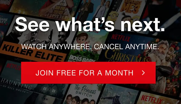
Netflix's "No Risk" Guarantee
Netflix gives their customer a "no risk" guarantee with their one-month free trial. What aspiring Netflix watcher doesn't want a free month of streaming Orange Is The New Black or Friends?
You can also lower risk with free swag. And that "swag" should relate to whatever you're selling. For example, with Audible, you get free audiobooks when you sign-up.
Three, to be exact.
You can put this idea into action for your own CTAs by finding ways to take the pressure off for your visitor. You can gain their trust by giving them what they want, right from the beginning.
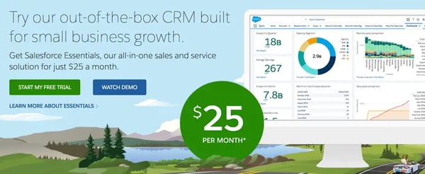
Salesforce For $25 A Month
If your price point is one of your key differentiators, lead with it in your CTAs. There's no simpler way to get a conversion than showing the visitor they can afford and get tremendous value from whatever you're selling.
In my opinion, this is where a lot of companies fail. The price tag is too high, and there isn't enough value for the visitor, or the price is low enough to attract customers, but it's not advertised clearly.
Salesforce does an exceptional job of putting their low monthly cost right on their homepage, next to their Free Trial and Demo CTA buttons.
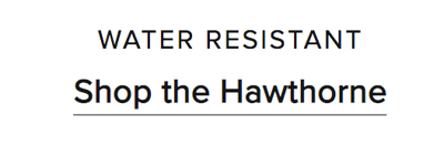
Tom's Ultra-Specific CTAs
Often, CTA button copy such as "Download" and "Shop Now" is overused. Online shoe and apparel company Tom's avoids this with specific CTA language. Each one reflects the category or product it leads to.
The button design is also very minimal, which helps. You can mimic this approach by using direct language at key conversion points, communicating exactly where the customer will go after clicking.
Casper's Clever Language
Casper uses wit and straight-forward language to make clicking more appealing. You made it this far, Casper points out. Want to see the mattresses?
The key with this language is mastering a tone and brand voice that the customer will respond to and trust. If you need to hire a conversion copywriter to get this right, do it. The messaging on your CTAS can make or break a sale.
HireVibe's Choose Your Own Adventure
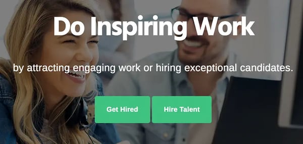
You may have two key personas and specific offers for each. In that case, you can try using two CTAs on your homepage. When you have two CTAs, your audience can self-select their path, giving you context on which persona they fit into.
HireVibe does this well with a call-to-action directed towards visitors looking for work, and another CTA targeted at companies looking to hire talent. Short, simple, and to the point.
The Shaker and Spoon Benefit/Outcome
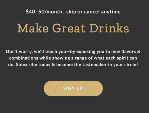
Shaker and Spoon's homepage CTA promises that with their product, you will "Make Great Drinks." It's an excellent CTA because it's a simple, specific promise. The lead understands the value of signing up immediately.
They also add the pricing upfront, which provides transparency and helps weed out leads that aren't an exact match.
Mint.com Addressing Discomfort
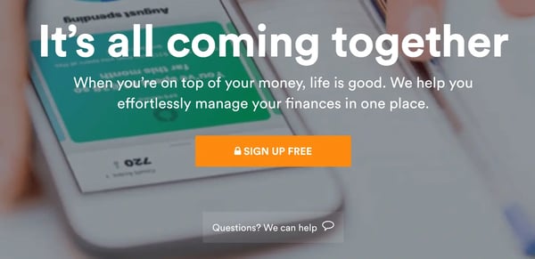
Finances are complicated for many people, and often uncomfortable to discuss openly. Mint.com embraces that discomfort with their friendly "have questions? We can help," link that lingers under their CTA button.
That way, before the visitor clicks on the sign-up CTA, they can get answers to any concerns or questions right away. If you sell a product or service that may be challenging for leads to talk about, and have low click-through rates on primary CTAs, try this out.
Delta and Lyft's Unexpected Partnership
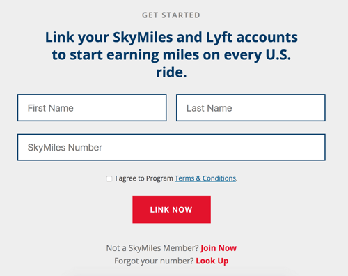
You can now link Delta and Lyft to earn miles. It's an unexpected offer from both companies, but one that frequent flyers (and ride-sharers) welcome with open arms.
Their CTA copy says it all, very succinctly. Link now. It couldn't be easier to do.
Lean Labs Intrigue
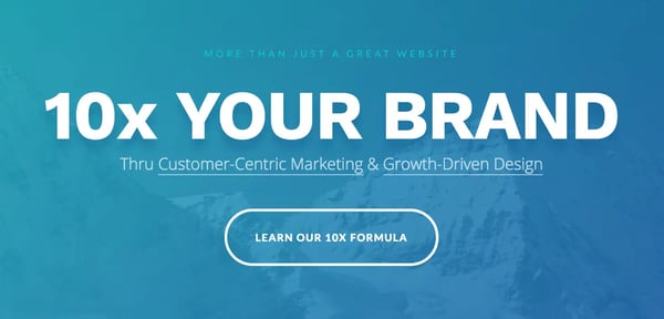
What's our 10x formula?
If you're a new visitor to our site, you don't know. But the mystery of the 10x formula is enticing enough to deserve a click.
That's why the "Learn Our 10x Formula" is the first CTA you see when you land on our website. It's a methodology we use to 10x client results, and this CTA leads to content and resources that demonstrate our ability to do so for your brand.
HubSpot's CompetitIVE LANGUAGE
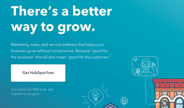
HubSpot is the best marketing automation platform --- but a lot of people still go with competitors who have similar functionality and are cheaper. HubSpot recognizes this, and challenges it with copy that says, "there's a better way to grow."
The subtle wink at their #1 spot and advantages of their service is the tell-tale sign of a very gifted copywriter who leads with the benefits.
Getting More Clicks From Website CTAs
A thoughtful, well placed CTA can generate a ton of clicks. And sometimes, even something as small as friendly copy on a CTA button, a witty headline about the CTA, or a free gift can win you a click. Over time, those clicks add up.
You can get even better results from your CTAs with ongoing optimization and testing. The more you learn about how visitors are engaging with your calls-to-action, the better you can adjust those CTAs to match their preferences.

CTA clicks.
