High-converting websites all have one thing in common: a phenomenal homepage.
A great homepage hooks your visitor, demonstrates expertise, and guides traffic to the next desired step.
It's like an airport with clearly marked terminals and gates. Everyone gets where they need to go quickly. There's no friction, no layovers, and no delayed flights. Because when there isn't that smooth experience, your homepage can lose you extremely valuable leads.
And in my experience, this kind of phenomenal homepage has a specific framework that a lot of high-performing brands follow.
The Best Content For A Website Homepage: 6 Awesome Examples
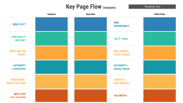
Here at Lean Labs, we use page flows to write website content. The template is great for getting the flow of a page down, because it sets up the structure of a truly customer-centric homepage.
When a homepage has these building blocks, the content tells a story from the customer's perspective. And the best examples of homepage content do this very well:
1. HUBSPOT: has A CUSTOMER-CENTRIC H1
HubSpot has a great homepage. The H1 copy says, "There's a better way to grow." Because to the customer, that's what HubSpot really is. An opportunity to grow and scale their marketing and sales efforts.
It's much more effective than talking about how HubSpot is the #1 Marketing Automation platform, or how many users are on it. Those things are important, but not directly tied to your visitor's goal.
2. ASANA: SHOWS How their product Helps the Customer
At the end of the day, customers don't care about your company. They don't want to hear about how great you are. They want to know whether or not you can help them.
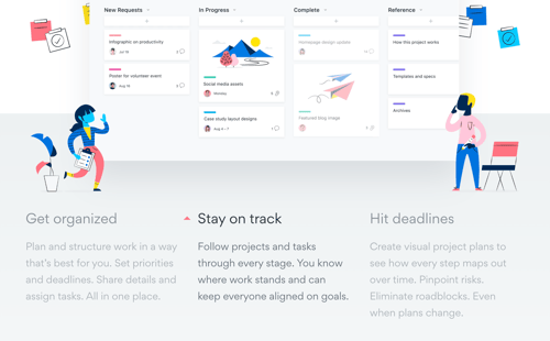
Asana is a great example of a homepage with content that answers this question.
Their target customer is a project manager, who likely, is struggling to stay organized and on top of tasks. In their content, they list out all of the ways that Asana helps you achieve productivity goals and hit deadlines, which aligns closely to the pain points most managers are experiencing.
3. lemonade: identifIES and addresSES the risks
Customers are smart, resourceful, and well-informed. They can figure out how to solve their problem without you. That's why you're always at risk of losing a customer to another solution.
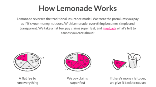
On Lemonade's homepage, they get in front of this by addressing any and every risk a customer takes by switching to their platform.
They talk about fees, how to switch to Lemonade, and how long it takes to apply and get approved for their insurance.
4. mailchimp: USES STATISTICS THAT SUPPORT THE STORY
In homepage content, including testimonials and statistics is key. But what can make this data even stronger is when it fits into an overall narrative. What's the story you're trying to tell the visitor? Which statistics, quotes, and facts reinforce that story?
Take Mailchimp, for example. The story they're telling is that you can turn your ideas into results. And while they only have one quote on their homepage, but it's a great one.
"Since running Mailchimp’s multichannel campaigns, we’ve seen an almost 250% increase in signups, and even more in terms of interest."
A 250% increase? Sign me up. I want that to be my story!
5. nutshell: AnticipatES ANY Objections
Whenever I create homepage content, I make a list of any reasons a website visitor won't end up becoming a customer. This includes their personal barriers, assumptions about the product, and existing allegiances. It helps me anticipate their roadblocks, and I can address it in my copy.
Nutshell does this really well.
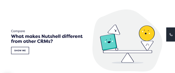
For instance, there's "What makes Nutshell different from other CRMs?"
It addresses the concern that Nutshell is too similar to the tools they're already using. It also leads to a page that compares Nutshell side-by-side to other solutions.
6. zendesk: drivES the customer to action
The entire point of your homepage is to get a visitor to take the next relevant action, such as converting on an offer or a lead magnet. And to get that conversion, a great offer is key.
You want the visitor to absolutely need to download it.
It needs to sell itself.
And even if it's a free trial or a demo that's isn't necessarily unique or exciting, there are still ways to drive your customer to action with your copy. You can pair it with messaging that describes what the direct benefit of your offer. Otherwise, you're not going to get that click.
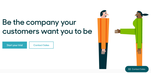
Zendesk, who offers a free trial on their homepage, does this well.
They use a highly compelling headline to lead into the offer:
"Be the company your customers want you to be."
Who doesn't want to be that kind of company?
And since the rest of the homepage has such good copy and follows the key page flow model, the customer already understands the value of a Zendesk free trial by the time they reach that CTA.
Creating Highly Effective Website Content
Like any story, there's a rhythm and flow to website content, especially on the homepage. There needs to be a clear start, climax, and conclusion. You need to write the buyer journey in mind.
The key page flow I shared above is only the start. With our strategy templates and resources, you can develop high-converting copy for each one of your most vital website pages.
As an Inbound Writer for Lean Labs, Melissa writes about high-converting websites and customer-centric marketing. She's an avid traveler, with trips to Iceland, Ukraine, and Portugal under her belt. She currently resides in Wilmington, North Carolina with her dog, Morrie.

