
5 Best B2B Websites: Inspiring Examples + Implementation Tips
Is your B2B website a conversion machine… or a total flop?
If your site feels like a flop, you’re not alone. Many businesses struggle to get their site to attract the right attention and convert those visitors into leads and customers. These businesses pour time, money, and resources into ads, graphic design, and social posts…. And still fail to see results.
On the other hand, industry leaders leverage their websites to drive explosive growth, leaving competitors wondering what secret sauce they’ve added to their sites.
This post unmasks that secret sauce once and for all!
We’ll walk through five top-notch B2B websites, showing you what they’re doing, why it’s working, and, most importantly, how you can steal these insights for your own website.
What Makes These The Best B2B Websites?
Before we explore our list of some of the best B2B websites we’ve seen lately, let’s answer a critical question: what sets a great B2B website apart from the crowd? Building any website can be a challenge, but B2B sites have some specific challenges.
1. Plaid
Plaid offers services in the fintech industry. They serve as an intermediary between financial institutions and everyday applications. Plaid enables the connection of bank accounts to popular apps like Venmo or Robinhood, essentially functioning as the underlying technology that makes financial data accessible and secure for both businesses and consumers.
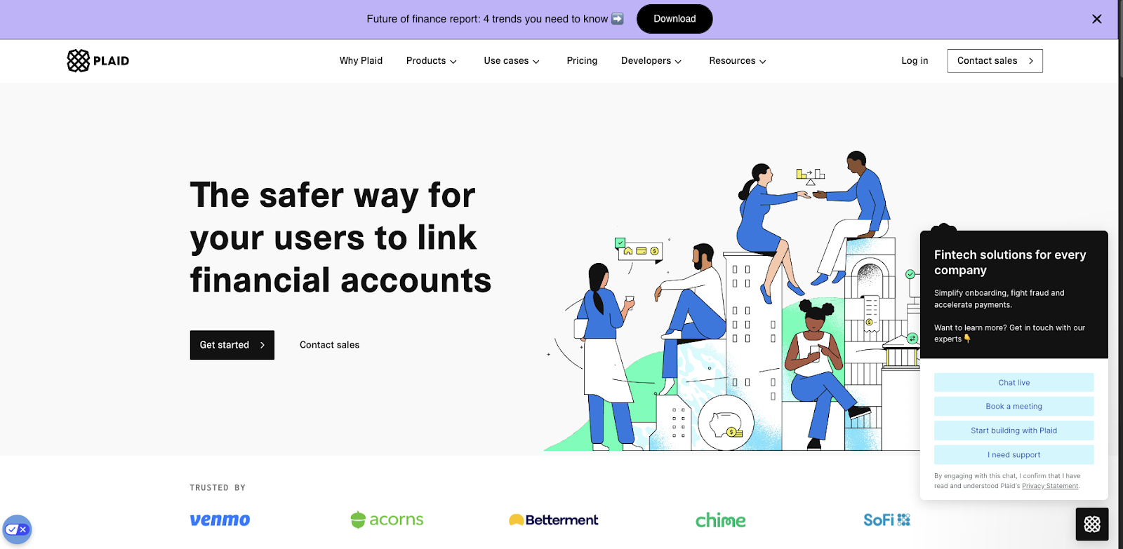
Some key elements of Plaid’s website include:
- Simple Navigation: The website features an intuitive and streamlined navigation structure. Menu items are clear and concise, efficiently guiding visitors to the information they need.
- Social Proof: Plaid prominently displays its impressive client portfolio on the homepage, helping it to establish credibility and trust with visitors.
- Live Chat Feature: An accessible live chat function offers real-time support and answers to visitor questions and concerns, enhancing user experience and engagement.
- Clear CTA Bar: A prominent call-to-action bar at the top of the page directs visitors to the next step in the funnel. A hello bar is an excellent option for businesses looking to avoid a pop-up while still putting their offer front and center.
- Customer-Centric Copy: The website's content speaks to the customer and their needs. Notice how everything from the navigation bar to the header and beyond speaks to the impact their solution can have for their customers rather than just listing features.
To incorporate similar elements of effectiveness into your own B2B website, consider the following strategies:
- Streamlined Design: Implement a clean, intuitive navigation structure. Plan your layout before development using design tools like Figma or Sketch.
- Client Showcase: If you have notable clients, feature them prominently for social proof. Tools like Canva can assist in creating a professional client logo section.
- Immediate Assistance: Implement a live chat feature to enhance customer support. Platforms like Intercom or Drift offer robust solutions for this functionality.

2. Zapier
Zapier is a leading automation platform that serves businesses across various industries. The company specializes in connecting different apps and services, allowing users to create automated workflows (called "Zaps") without requiring coding knowledge.
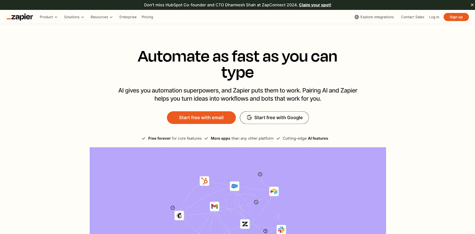
Let’s take a look at some of Zapier’s site elements that work well:
- Nested Navigation: Zapier serves a wide range of customer types and offers a massive variety of services. Instead of overcrowding its navigation, it created nested navigation menus, giving the user lots of options without cluttering the interface.
- Compelling Visual Demonstration: A prominent animated GIF on the homepage illustrates Zapier's unique selling proposition. The GIF is dynamic and shows the platform's functionality quickly and effectively.
- Use Case Visualizations: The website features snapshot visuals of product templates categorized by use case. This approach helps visitors see how Zapier’s solutions fit their specific needs.
If you want to copy Zapier’s site elements, here’s some great places to start:
- Dynamic Visuals: Utilize animated GIFs or short videos to showcase your product's core functionality. Tools like GIPHY or Loom can assist in creating these engaging visual elements.
- Template Showcases: If applicable, create visually appealing displays of your product templates or use cases. Design tools like Figma or Sketch can help in making these snapshot visuals.
- Responsive Design: Ensure your website is fully responsive across all devices. Frameworks like React or Vue.js can facilitate the development of a dynamic, responsive site.
Related Read: Modular Web Design: How We Build Websites That Convert
3. HubSpot
HubSpot is a leading customer relationship management (CRM) platform that serves businesses of all sizes across various industries. The company provides a comprehensive suite of marketing, sales, customer service, and operations tools designed to help companies to grow.
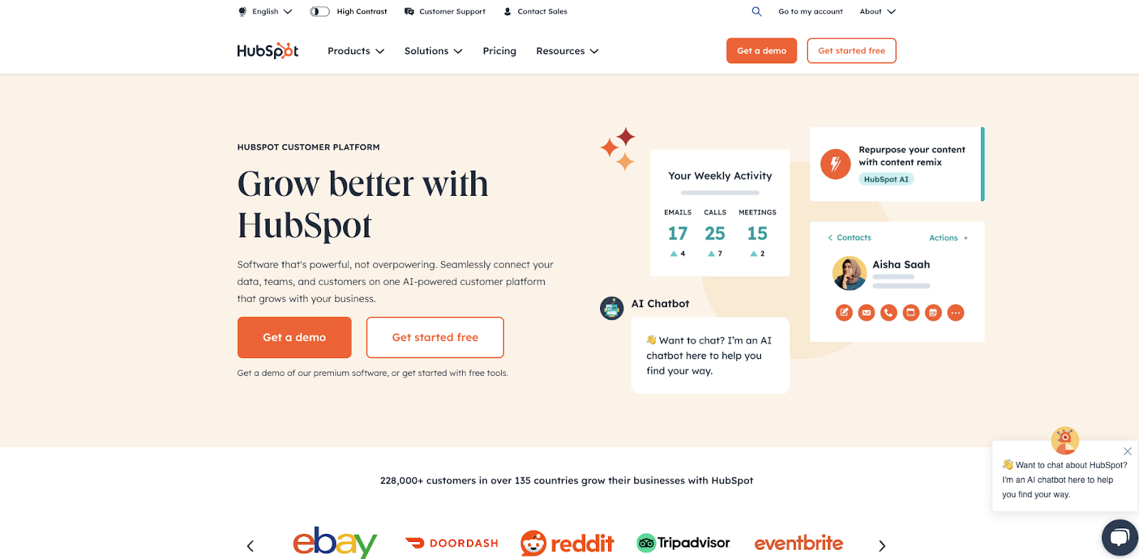
HubSpot is a powerhouse of B2B marketing, so it’s no surprise that their site is on our list. Let’s take a look at a few elements that make it great:
- Interactive Assistance: The site features a chatbot with quick assistance options. The chatbot provides immediate support to visitors, helps them feel supported, and guides them efficiently through the site.
- Clear Call-to-Actions (CTAs): Prominent and strategically placed CTAs throughout the site make it easy for visitors to take the next step, whether it's getting a demo or starting with free tools.
- Distinctive Visual Branding: The website maintains a consistent and unique visual identity through its color scheme, design style, and overall tone, creating a memorable brand experience. It’s clear from the moment a visitor gets onto a HubSpot page that they’re on a HubSpot page — and that’s important.
- Customer-Centric Approach: The entire site is structured around addressing customer needs and pain points, demonstrating HubSpot's commitment to customer success.
If you want to steal some of HubSpot’s success for yourself, here’s how to get started:
- Cohesive Branding: Develop a strong brand guide and ensure consistency across your site. Tools like Adobe Color can help create a cohesive color palette if you don’t have a designer on staff.
- User-Centric Design: Conduct user research and create user personas to inform your site's structure and content. Tools like HotJar or Lucky Orange can help you see how users navigate your site. You can use this data to adjust your page flow and make it a smooth, seamless experience for visitors.
- Content Management: For easy content updates and management, consider using a robust CMS like WordPress or HubSpot's CMS Hub.
4. High Fidelity
High Fidelity is a technology company specializing in spatial audio solutions for group voice chat. They serve industries ranging from virtual events and online meetings to gaming and entertainment, providing advanced audio processing capabilities.
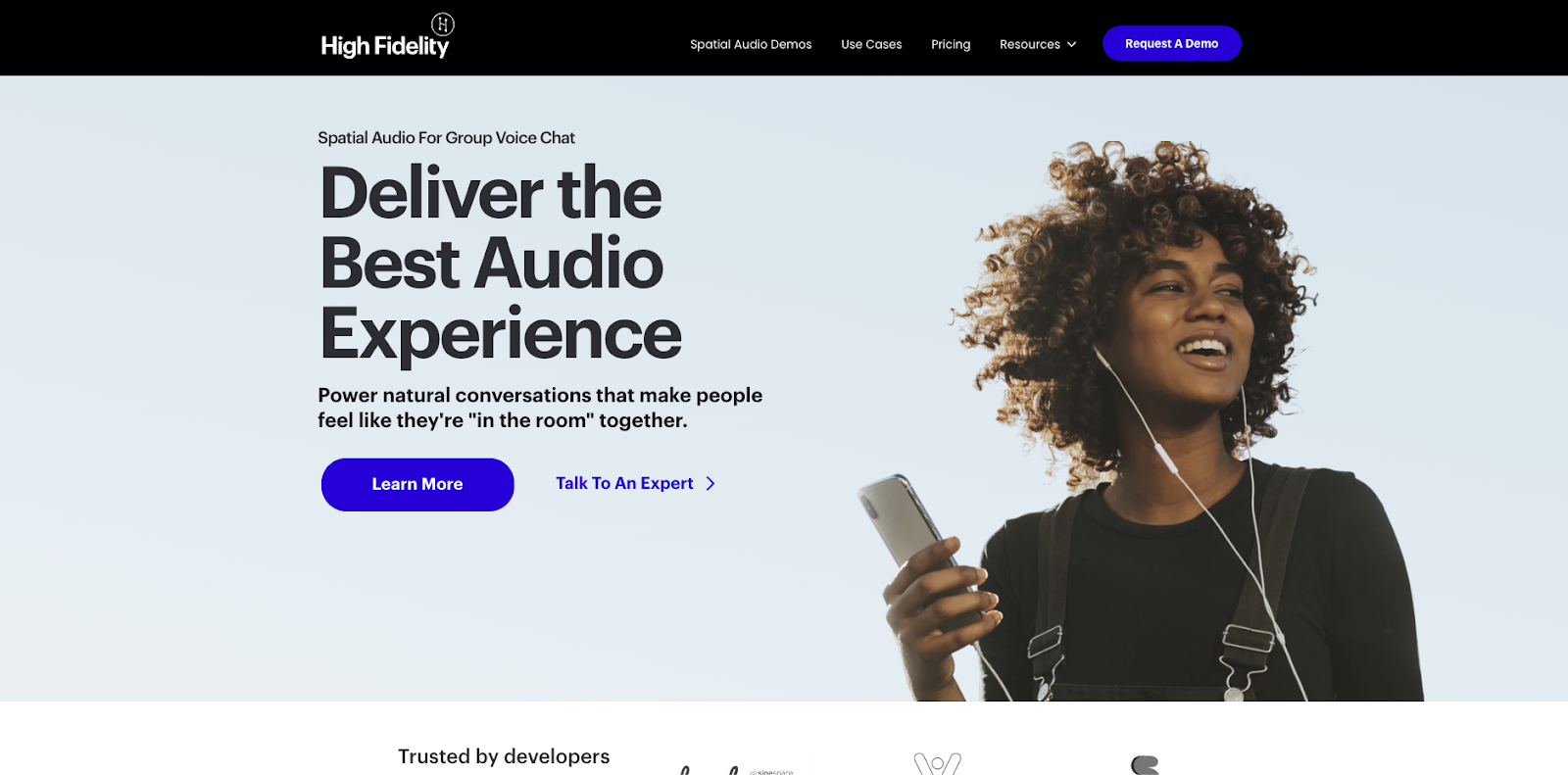
Full disclosure: We built High Fidelity’s site, so we are patting ourselves on the back a bit here. But here are some of the things we focused on to make sure High Fidelity’s site was top-notch:
- Demo and Use Case Focus: High Fidelity’s ideal customer is skeptical — they need to see how the tool works for themselves. As a result, the site prominently features demos and use cases, effectively proving the product's capabilities and demonstrating its real-world applications.
- Accessible Technical Information: Product specifications and technical details are presented in simple language, making complex information understandable for all visitors regardless of their technical background.
- Clean, Simple Design: The website maintains a minimalist aesthetic, avoiding clutter and allowing key information to stand out rather than overloading the user with a list of product features.
- Distinctive CTAs: Call-to-action buttons are clear and strategic, using contrasting colors to stand out against the predominantly monochromatic design of the above-the-fold section.
If you want to use some of these tricks, here’s how to get started incorporating them into your site:
- Simplify Technical Content: Cut the jargon! Make sure you’re writing your content in terms the average reader understands. Use tools like the Hemingway App to ensure your technical content is readable and accessible to a broad audience.
- Minimalist Design: Employ design principles that prioritize white space and content hierarchy. Design tools like Figma or Sketch can help create clean, uncluttered layouts.
- Performance Optimization: Use tools like Google PageSpeed Insights or GTmetrix to ensure your site loads quickly and efficiently, which is especially important for demo-heavy sites.
5. Sprocket Rocket
Sprocket Rocket is a website-building tool specifically designed to create HubSpot websites. They serve marketers, designers, and agencies who use HubSpot's CMS, providing a no-code solution for building professional, customizable websites quickly and easily.
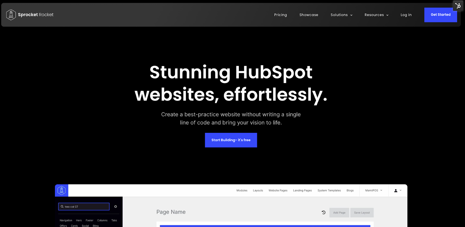
As a company in the business of building websites, Sprocket Rocket’s site has to be strong — and it lives up to those expectations! Some of Sprocket Rocket’s key differentiators include:
- Bold yet Simple Color Scheme: The site uses a striking but uncomplicated color palette that enhances visual appeal without overwhelming the visitor.
- Intuitive Navigation: The website features a straightforward and easy-to-understand navigation structure, allowing visitors to find information quickly.
- Interactive Product Demonstrations: The site incorporates interactive design elements that showcase the product's capabilities in a subtle, user-friendly manner.
- Comprehensive Social Proof: Sprocket Rocket effectively leverages various forms of social proof, including customer quotes, client logos, and a gallery of websites built using their tool.
You can mimic Sprocket Rocket’s approach in the following ways:
- Color Scheme Design: Use color theory principles to create an impactful yet balanced color scheme.
- Interactive Elements: Incorporate subtle animations or interactive elements to demonstrate your product. Focus on creating engaging, unobtrusive interactive elements that allow interested users to drill deeper without hurting the performance of the site as a whole.
- Diverse Social Proof: Collect and display various forms of social proof. Create a dynamic client logo section and a portfolio gallery to showcase your product's versatility.
- Use Sprocket Rocket: This one is kind of a cheat, but this tool is a modular site-building tool for HubSpot. If you want to create a gorgeous, high-conversion site without coding, you can use Sprocket Rocket’s drag-and-drop site builder.
Learning from the Best B2B Websites
Examining these five stellar B2B websites can help you kick off your next website project on the right foot. From Plaid's seamless user experience to Sprocket Rocket's interactive product demonstrations, each site provides a masterclass in B2B web design.
However, it's important to remember that these websites didn’t grow overnight! Each amazing B2B site is the result of extensive planning, testing, and refinement. Getting started with your own site redesign involves more than simply emulating these best-in-class examples. It requires a strategic approach tailored to your unique business needs and audience expectations.
Creating a website that not only looks great but also drives conversions demands a well-structured playbook. That's why we've developed our free training resource, "The 4 Pillars of a Winning Website." This training resource distills our top tips and tricks for what makes B2B websites truly effective, providing you with a roadmap to create a site that's not just visually appealing but also strategically aligned with your business goals.
Ready to transform your website into a powerful business asset? Dive into our "4 Pillars of a Winning Website" training today and lay the foundation for a B2B website that crushes your conversion goals.


About Lean Labs
The only outsourced growth team with a track record of 10X growth for SaaS & Tech co's. 🚀
Explore Topics

Discover the Hidden Strategies We Use to 10X Our Clients Growth in 36 Months!
The Growth Playbook is a FREE guide to planning, budgeting and accelerating your company’s growth.


