Does 'Above the Fold' Still Matter?

Does 'Above the Fold' Still Matter?
Is above the fold still a relevant conversation?
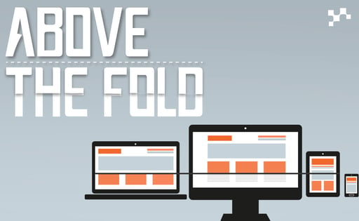
The term "the fold" is in reference to the folded upper half of the front page of a newspaper. This section is usually where important stories or subjects are displayed. This has immense value in the print world as newpapers are folded in a way that only the content above the fold is visble to customers in the purchasing kiosk.This same practice made its way to the web where "The fold" is used synonymously with the segment of a webpage that is visble without the need for scrolling. In the 90's screen resolutions were significantly smaller and for the most part, consitent. This lack of variety allowed for the industry standard of 800x600 to be widely accepted. Webmasters would work aimleslly to cram as much content into this viewport as possible. Hierchal structure took second place to experiments of how small text could be on a page before deemed incomprehensible. Many of these practices have augmented themselves in the modern web but the spirit of "the fold" custom lives on.
The fold today
Its now 2017. Self driving cars, wearable tech, drones, etc. are all now beginning to flood the market. The world has become more science fact than fiction, yet in some respects old practices seem to have piggybacked there way into our modern tech.
In the modern web we do not design for specific monitor resolutions. We design responsively with an emphasis on mobile devices. This change is with good reason, the modern web has dozens of popular resolutions and aspect ratio's. Developers and Designers are tasked with making websites suitable for this large array of devices.
So why does all of this matter to you and your users? In the early renditions of the web, scrolling wasn't common place. We're talking a time before trackpads and scroll wheels. In the early versions of the web, scrolling was a cumbersome input. It required finding a scroll bar and clicking & dragging. All of that changed in 2007 with the release of the iPhone. Not only did people learn how to scroll, scrolling became one of the most popular inputs on mobile devices. Users now understand that all the infromation on a website can't be displayed on a single screen.
the aftermath
Nearly 10 years after the introduction of the iPhone, the landscape of the web has changed. In 2014 Internet usage on mobile devices finally surpassed that of personal computers (desktop units). This change truly renders "the fold" practice obselete in many ways. It'll take time until the web has fully adopted this realization.
However, scrolling is here to stay and the evolution of the web doesn't have much room for "The fold".
is the Head of Growth Driven Design at Lean Labs. He’s a professional at running in ovals and clearing barriers by day. By night he delivers websites, among other things to Lean Labs clients. Miles enjoys spending time with his girlfriend, getting his hands on new tech, and hiking in the beautiful greenbelt of Austin Texas.
About Lean Labs
The only outsourced growth team with a track record of 10X growth for SaaS & Tech co's. 🚀
Explore Topics
Recent
Related
Popular
- CTA Best Practices: Crafting Calls-to-Action That Actually Convert
- The 5-Step Startup Marketing Strategy Fueling Massive Growth in 2024
- From Platform Problems to Performance Gains: HighByte's Website Evolution
- Clear, Clean, and Conversion-Ready: HubSearch's Journey to a Better Website
- 8 AI Marketing Tools Your Team Needs (+ How To Get The Best Results)
- How to Repurpose Your Content: The Best Way to Increase ROI
- Is HubSpot the Best Marketing Platform Choice for Startups?
- The In-House Business Video Production Process to Make Video Content Fast and Easy
- The Exact Email Marketing KPIs You Should Focus On (and Why)
- 3 Steps to Climb the Sales Automation Ladder

Discover the Hidden Strategies We Use to 10X Our Clients Growth in 36 Months!
The Growth Playbook is a FREE guide to planning, budgeting and accelerating your company’s growth.


