Getting someone to do what you want them to is hard work. If you have children, you understand.
Customers can be just as tricky, especially since you're not always having face-to-face interactions. Moving them in the right direction comes down to a few critical skills with the flair of personal technique.
This post will give you some ideas for how you can grab their attention, right after we explain the basics for creating calls to action (CTAs) that people want to click.
Calls to Action that Work
Do you remember when direct mail used to come in, asking for you to mail back for subscriptions or more info?
The fancy card-stock they arrived on with eye-catching images and claims are representations of the infancy of CTAs. The concept of CTAs started far prior that, but it's incredible to see how far we've come in our ability to grab someone's attention.
In the digital age, we've adapted CTAs to fit everywhere on your screen. They're on websites, in emails, on search pages, and in our social media. It's impossible to avoid them while surfing the web. But that's good. After all, if you could ignore them, they wouldn't be doing their job.
Creating calls to action is essential for gaining leads. They send customers further along their journey to reach the next stage towards making a purchase. Focus on making them customer-centric, like the rest of your company should, and you'll find enormous success.
You can learn more about what we mean by "customer-centric" and how we deliver customer-centric solutions to 10X our clients here.
As you start to plan out your own CTAs, you need to work through the basic info first.
Who?
First, identify the target audience for this CTA by selecting one of your pre-defined avatars.
Multiple CTAs can, and should, be created for the same lead magnet, so it's important to fine-tune the offer to the specific persona you're trying to engage. The customization possibilities are limitless with graphics, location on the page, and copy, all being easily managed to reach your audience.
What?
The "What" question determines what you're offering and what your goal is for the CTA.
There are tons of lead magnets or offers you can use, but you need to be clear about what the viewer gets when they do what you're asking. For example, button text can range from "Start Your Free Trial" to a simple "Join Now". The point is that it's starting a clear and concise transaction.
Where and When?
CTAs can be programmed to appear in various locations and at various times. Some will pop up based on how far down the page the reader has moved. This is handy if you want to get your customer's feet wet with the subject before making an offer.
You can also set up a "Hey Wait" popup that takes effect when their mouse crosses the threshold of tabs on your browser.
Some will scroll on the sidebar, following you as you read. Others are located at the bottom of the page, not distracting you from the content you're there for.
Why?
"Why" gets after the emotional connection to your product. You need to identify what your customer's purpose for viewing your content is. You can find these in your personas, but as you fine-tune the avatars more, you'll be able to get more specific on meeting their needs.
How?
"How" gets into the actual creation of the CTA and the planning that comes with it. There are many tweaks you can give your CTAs, but it's important to test multiple variations and find what works the best for your audience. Using A/B testing is an easy way to compare which copy, graphics, or location works best for your CTA.
Once you've worked through the five questions above, you're ready to build your own. We have more tips for creating outstanding CTAs, but below are six examples of calls to action that show off the possibilities.
1. Amazon Prime Video - Ad
This ad displays on various websites, including their own. It's effective because it makes use of contrasting colors, provides a no-risk disclaimer, and is concise. The ad leaves no room for questions, and the button uses the word 'explore,' hinting that there's a lot you haven't seen yet.
2. OptinMonster - Banner
This banner appears at the bottom of OptinMonster pages. The colors are bright and contrasting, as they should be. The button and copy create a sense of urgency with words like 'now' and '60 seconds.' They even threw in a question to entice the viewer to ask what's holding them back.
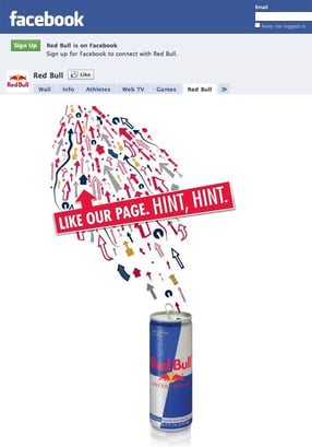
3. RedBull - Social Media

RedBull posted this pinned image on their company Facebook page. It makes creative use of Facebook's button layout. The colors are eye-catching, causing the viewer to look closer and realize all the arrows point to the 'Like' button. The text even jokes at its bluntness.

This sidebar CTA from Wordstream follows you down the page as your progress through the article. It encourages readers who are enjoying the content to take action by always providing the action they want the reader to take. The button highlights a free offer, and the surrounding copy touches the pain-points of their readers.
5. Square - Above-the-Fold
Above-the-Fold CTAs are some of the most eye-catching, without being distracting. Square does an excellent job, providing a bright and colorful picture that still allows the button to stand out. They're asking the reader to fill out three fields, rather than one, but the "Free Card Reader" offer is strong enough to get the conversion.
People viewing Square's site are there for two reasons. They're looking to access their account or get more info. For the latter, this is the perfect CTA to grab potential customers.

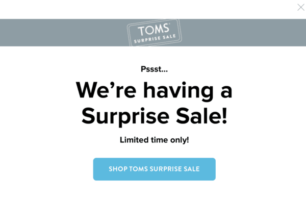
Tom's creates urgency with this popup when you visit their site. Because it takes over the page, it's impossible not to pay attention to it. The button stands out, and the text is brief but captivating. Since a customer is already there to shop, seeing a sale may encourage them to may an additional purchase they weren't planning on.
Creating Your Own Calls to Action
You may not be able to get your children to do exactly what you need, but by learning from the examples above, you may be able to influence your customers to.
Creating and testing CTAs can be enjoyable and provide you insights into your audience's preferences. Follow some basic practices, like building a sense of urgency, including a no-obligation statement, and adding some attractive copy, and your customers will start clicking away.
A useful tool for creating your own is Hubspot CTAs. It makes the process simple and the hardest part becomes deciding on what to offer.
Don't forget to test various aspects of your CTAs, but if they're still coming up short. Something else could be wrong with your site. Our Website Health Exam will help you identify the potential problems your website is suffering.