Generating enough qualified leads is the single biggest challenge facing modern B2B marketers. In fact, half your peers plan to their lead generation budgets in the year to come. It's safe to say some of those new dollars will go straight toward landing page development and optimization.
The ultimate key performance indicator (KPI) of a landing page is leads generated. However, marketers must track closed-loop analytics, a measurement of the percentage of leads that ultimately become customers, to determine just how effective their pages are.
If your pages set unrealistic expectations around your content offer or attract unqualified prospects, your leads won't turn into sales. In some cases, prospects can feel resentment if they feel landing page copy has set unrealistic expectations about a content offer. Landing pages don't just need to convert; they need to convert the right prospects.
What Defines a Brilliant Landing Page?
The world's best landing pages have stellar conversion rates (6-25%, depending on industry), and they set reasonable expectations. These pages attract qualified prospects who are ultimately qualified to become customers. They almost always include the following components:
- A compelling, unique value proposition (UVP)
- Effective expectation setting
- Appeal to prospects' needs, fears and wants
For more on the mechanics and attributes of an effective landing page, check out 4 Things Every Single Landing Page Should Include.
Inbound marketing budget invested in landing page optimization is worth your while. Research indicates that the more landing pages you have on your website, the more leads you'll generate. Return on investment (ROI) sharply increases for sites with 30 or more offers.
Here are a few examples of brands with beautiful, well-worded landing pages - and why they're so exceptional:

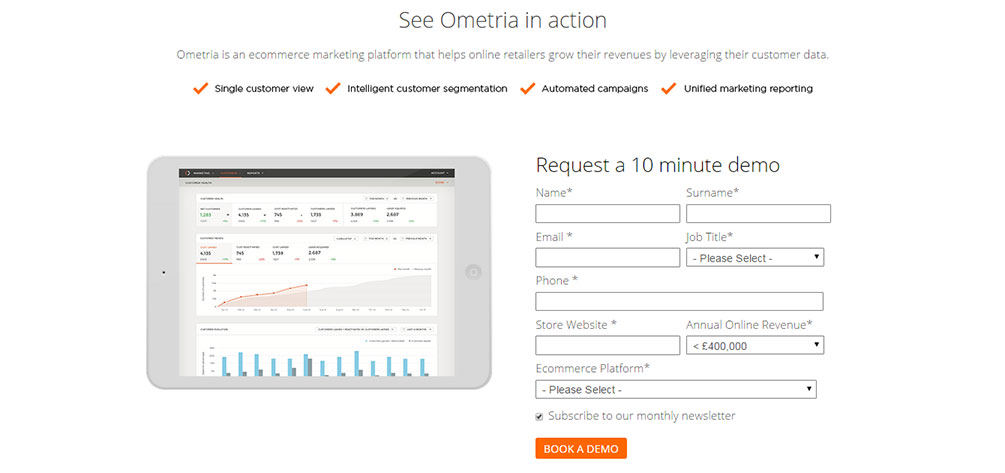
eCommerce marketing platform Ometria has a complex product, but they manage to keep their demo landing page nice and simple. The horizontal bullet points across the top of the page reiterate benefits customers of the software can enjoy. The form headline, inviting readers to "request a 10-minute demo" sets very clear expectations around exactly what they can expect if they submit the form.

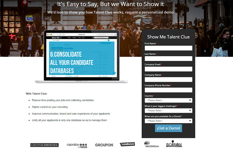
One of the most effective landing page visuals we've encountered recently is via talent software vendor TalentClue. The laptop screen shows a step-by-step overview of the process used human resources managers using the product. This allows the on-page bullet points to focus exclusively on benefits. Finally, trust factors are established by listing the major brands using the product via logos at the bottom of the page. Companies who educate prospects via eye-grabbing animations are ahead of the curve when it comes to landing pages.

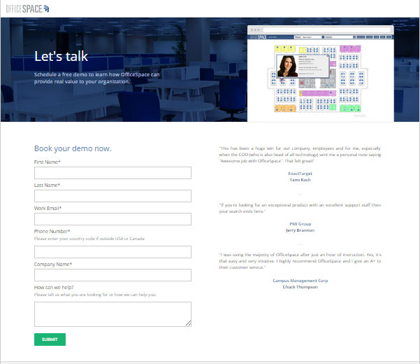
OfficeSpace is a vendor of facilities management software for very large organizations. Their buyer personas are often seeking positive feedback from C-Level operations management, convenient support, and an easy-to-use product. These benefits are communicated clearly via customer quotations from recognized brands. It's an innovative approach to landing page design, which allows this vendor to build instant trust and the right expectations with prospects.
Designing Your Best Landing Page
By optimizing landing pages to convert the right leads, marketers can solve one of their biggest pain points. Instead of struggling with too few leads, or too few well-qualified leads, their sales pipelines can be filled with prospects who are ready to become ideal buyers. You don't need to write lengthy landing page copy to set reasonable expectations and pre-qualify your prospects. It's a matter of communicating clearly exactly who you can help, and what you have to offer.
Focus on three things when building your landing page:
1. briefly communicate the value of the offer.
All three of these landing pages do an excellent job of making even complicated offerings easy to understand. Bullet lists or some other way of categorizing value points are great at this.
2. Include Great Imagery
A picture is worth a thousand words. Don't tell me, show me! These two phrases are essential to a great landing page.
3. Repair the Leaks
Remove distractions and focus on one thing, the conversion. Too many landing pages include link leaks or additional options for the user that can lead them away from the landing page. If they are on the page to begin with, it's because they are interested in the offer. Don't offer them something else that will give them the "shiny object" syndrome.
Remove navigation and footer links. Make the entire page move the user to the form, and you will see conversion rates increase. Save your additional or alternative offers for the Thank You page.
Can you tell which of these three landing pages didn't follow these three simple steps?
Ryan's experience ranges from higher education to SMBs and tech startups. When not doing digital marketing, he's sure to be enjoying some kind of nerdy pastime.


