16 Companies Who Absolutely Nailed Their Unique Value Proposition
What is the purpose of your website? To attract business. This is the goal of every other website out there. Your competitors are using their websites to attract customers, the same as you.
So what sets you apart?
That's why your unique value proposition (UVP) is so important: it quickly and accurately conveys what you have to offer. One of the first steps we take with clients on our way to 10x growth is to settle on the UVP.
Learn more about our 10X Growth Marketing philosophy.
Explaining your UVP as quickly and accurately as possible ensures your website visitors understand how you can help them.
The best way to convey it quickly and zaccurately is to find a UVP headline that accomplishes its purpose in the fewest words possible. While details are important, communicating that you can solve my problem is a higher priority than how you will solve my problem.
website grader
What's Killing Your Website Conversions? Find Out Now
Use our proven conversion kit to analyze your website. Uncover what’s working so you can amplify it, pinpoint areas that need improvement, and get our expert advice on how to turn your website into your brand’s #1 salesperson.
- Diagnose your biggest website pitfalls
- Step-by-step recommendations for improvement
- Maximize visitor engagement and conversions
Thanks for submitting the form!
16 Companies That Nailed Their Unique Value Proposition
To clearly communicate your UVP to new website visitors, it's important that it is clearly understandable within the first few seconds of them landing on the site. It should communicate both what you do, and how you benefit the customer or solve their need.
These 16 companies have absolutely nailed their UVP headline.

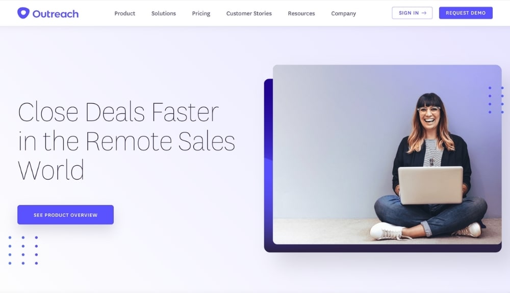
Being clear about who your solution is for is paramount when it comes to an effective UVP. Outreach does a fantastic job combining a clear niche of “remote sales world,” attracting sales professionals who use internet tools to optimize their sales process.
They take it a step further by implying that their solution solves the problems that sales folks encounter, that closing a deal takes time. Offering “close deals faster” as a solution builds on the desire of a salesperson to reduce the sales pipelines more quickly.
The simple formula of (1) identifying their target market and (2) including their motivation makes this UVP a winner.

Here’s another example that follows a similar format of identifying the target market and including their primary motivator.
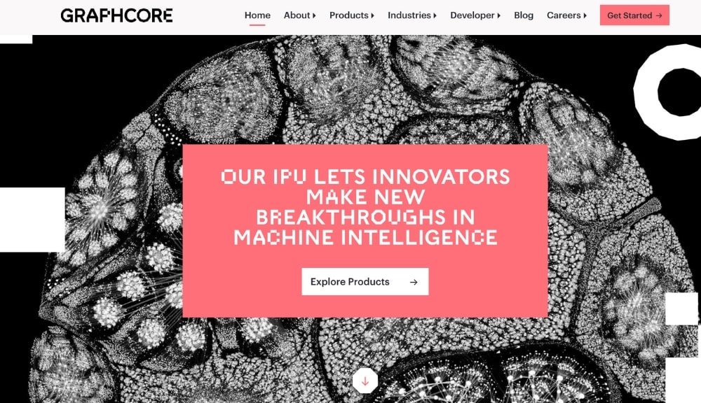
Graphcore … ”Our IPU let’s innovators make new breakthroughs in machine intelligence.” Innovators by itself would be too broad, but the second part of the UVP is where they nail it down,” new breakthroughs in machine intelligence.”
Graphcore structured their UVP to serve as an overarching frame that speaks to their diverse offerings. This isn’t easy to do well with companies that have many products.
One thing to note is that each product can and most likely should have individual UVPs. We see when we look at one of their products, the IPU-M2000+IPU-POD4. The UVP for this product is “Core building blocks for all AI infrastructure at scale.
These two examples demonstrate the flow that website visitors should take. An effective UVP will immediately capture a web visitor’s attention, then guide them to the next logical step through a call to action.

Convert Kit
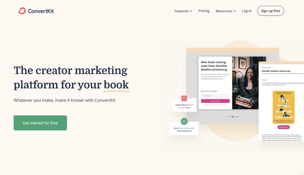
The most effective UVP’s are short and straightforward. Convert Kit’s is “The creator marketing platform for your book.” A UVP doesn’t always have to spell out precisely what the product or service is. Hitting the nail on the head with the emotional drivers is sometimes all you need. Convert Kit does this by alternating the end of their UVP to various creative projects like a book, album, or podcast.
Convert Kit addressed a central goal of creatives—communicating with their fans easily and growing their fanbase. Convert Kit associates with the goal shared by artists, musicians, and creatives, which is why folks of this ilk gravitate towards their platform for lead generation.

Being concise is difficult. As Mark Twain said, “I didn’t have time to write a short letter, so I wrote a long one instead.” Effective UVP’s are similar—the best ones are usually the shortest. But to find the right words, as simple as they appear, takes effort.
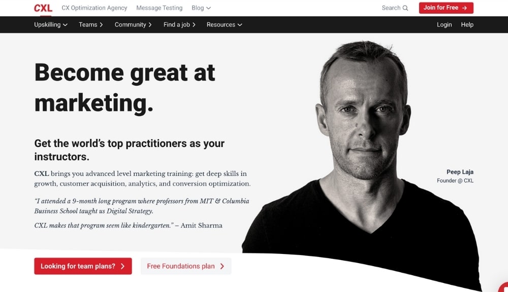
Many make the mistake of being cute or too clever with their UVP, which usually confuses or dilutes the message. CXL, a marketing company offering elite training, is an elegant company with a surprisingly simple UVP: “Become great at marketing.”
Any marketer who wants to increase ROI from their marketing efforts understands the implicit meaning of getting better at marketing their business. It means more revenue.
Another pattern that CXL does well is adding a short description that refines their UVP. For example, “Get the world’s top practitioners as your instructors” is a head-turning hook that makes the value of CXL jump off the digital page.

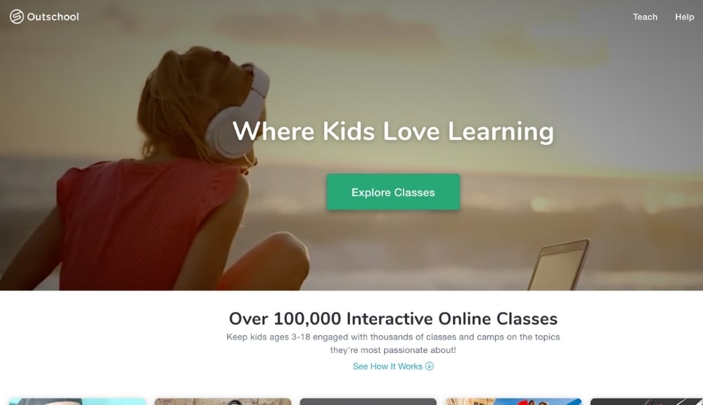
Here’s another ultra-simple example of an effective UVP and CTA combination. Any parent or teacher knows how challenging it is for kids to enjoy learning subjects like reading or math. Outschool addresses this pain point upfront with their UVP: “Where kids love learning.”
Every parent wants their kids to learn and enjoy it at the same time. Outschool’s UVP seems to promise a miracle and one that is worth trying out. UVP combines the parent’s desire to support their kids and to create an enjoyable experience for learning.

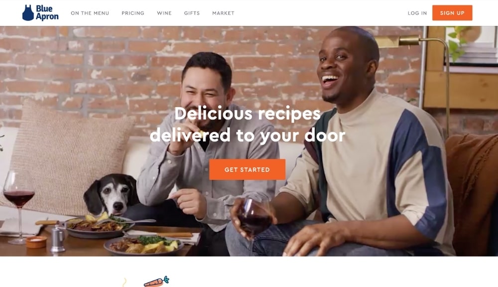
It’s impossible to write a killer UVP without knowing exactly who it’s for. Blue Apron does a rock-solid job with “delicious recipes delivered to your door.” It appeals to a broad audience (Who doesn’t like delicious food?) that like convenience, frequently use online services, and want to cook.
Many marketers struggle to attract their ideal customers. Developing a UVP is similar to suggesting a product or service to a friend that you know intimately. A well-crafted UVP goes beyond getting a click to your CTA. Instead, it’s a sign, much like a flag, that lets an audience know they’re in the right place.

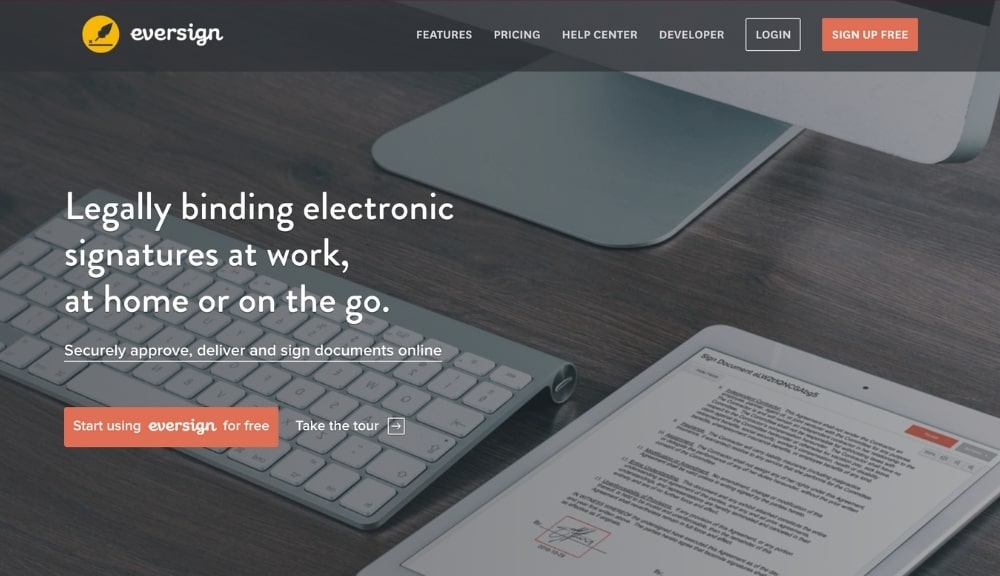
Eversign’s UVP is straightforward and useful: “Legally binding electronic signatures at work, at home or on the go.” For those that can’t stand paperwork, this could be a life-saver. The scenarios you’d use the service come to mind, which is a feature of effective UVP. By placing the user in the context of when they need the service, it feels familiar.
It also works in reminding the web visitors of the frustrating times when they’d have to do things the old-fashioned way and get a signature. Visitors quickly see the value based on their past experiences.

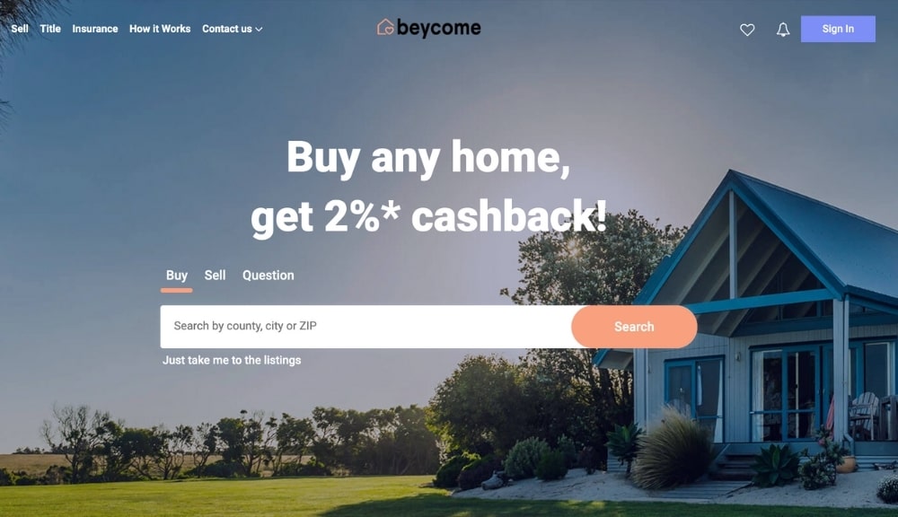
You can think of your UVP as a split-second elevator pitch, getting to the point as quickly as possible. Beycome is no exception, with “buy any home, get 2%*cashback!” in bold letters on their homepage. They follow it with a simple search field to buy, sell, or option a property, and you’re able to start searching for a property with a zip code.
How could a homebuyer resist after reading their UVP? They get cashback if they purchase a home? Sounds terrific, and it’s not limited to a type of property? What’s the catch? A UVP that gets the audience to ask an unstated question is highly effective. It means that it’s done its job to catch attention and ask for more information.
Now they may think, do I need to look anywhere else? Beycome’s UVP focuses on homeownership and simultaneously takes away part of the risk of losing money by offering a cashback.

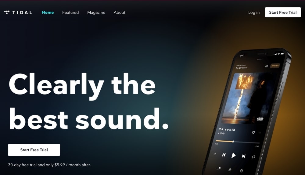
In a landscape full of music streaming services, Tidal caters to those that prefer the best quality. Many people do not, preferring convenience or familiarity over an underdog. By specifying that they offer “clearly the best sound,” they reconcile what many audiophiles hold as their sole criticism of digital audio—degraded sound quality.
With Tidal, people who enjoy analog gear like records and turntables have a place to turn if they want the best possible audio quality when it comes to streaming audio. It’s not for everyone, but targeting their group allows them to focus on building a loyal following.
Tidal knows it will never compete with Apple Music or Spotify on the same playing field. That’s why they created a brand identity around refinement rather than pure utility.

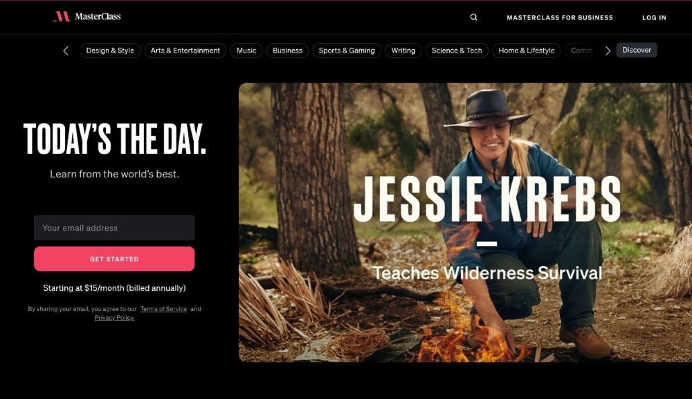
Who would you want to teach you to cook if you were searching for online classes? A random instructor or Gordon Ramsey? Masterclass makes it clear with "learn from the world's best" that you have the opportunity to learn new skills from some of the world's most successful leaders in their field.
When developing a UVP that serves a broad audience, if it excites and makes one wonder, who wouldn’t want that, it’s effective. So instead of putting superfluous text to explain how their programs work, they reinforce their UVP with tiled images of the instructors you’d be learning from.
Combining the images placed strategically next to the UVP leaves no doubt the value you’d get from their content. They let the words speak for themselves without having to add complicated bells or whistles. You’re Getting lessons from famous experts. Simple. Exciting. And a unique choice when someone wants to learn a new skill.

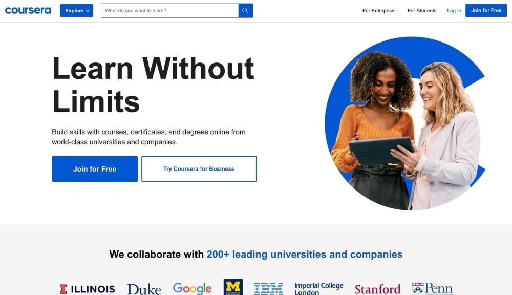
Equally as powerful, but taking a different approach, Coursera UVP is “learn without limits.” When taken together with their brief description, it’s clear that one can earn college credit and skills that can serve them in their current job or help them move into a new career.
What’s different here is the focus of the UVP, targeting a person who wants a career change or academic credit for an advanced degree. Masterclass, mentioned above, also targets online learners, but primarily hobbyists. Coursera’s UVP pinpoints professionals looking to develop skills for career advancement.
VIDEO INSIGHTS
Learn The 4 Pillars Of A Winning Website.
Watch the FREE video training to learn:
- The #1 marketing mistake most websites make
- Four pillars of a winning website
- A step-by-step process to apply these pillars to your site
Thanks for submitting the form!
Even with a strong UVP, extra content helps to solidify who the message is for. For example, the bright logo below their UVP with University logos is how it takes a demarcation from Masterclass.
When you scroll down their website, one could say that they have many UVPs like, “achieve your goals with Coursera.” However, remember that each product or specific service can have a UVP.
When evaluating UVPs in your niche, the headliner on the webpage is the main UVP that all other UVPs help make the marketing copy perform better at its max potential
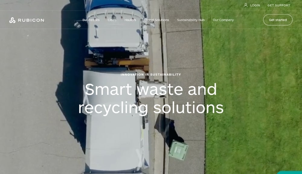
“Smart waste and recycling solitons.” Rubicon’s UVP offers a simple benefit to a complex, global challenge. When you scroll down the homepage, you see the same theme: clean, simple, and easy to read.
Many brands make the mistake of overcomplicating their message and confusing their visitors by giving them too much information out of the gates. Rubicon’s UVP is a fantastic example of a springboard helping visitors find the most relevant information, all without having to fumble around their webpage.
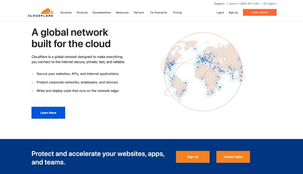
Cloudflare’s UVP is less upfront than some of the other examples we’ve mentioned, situated barely above the fold with “protect and accelerate your website, apps, and teams.” The technical folks who search out solutions like Cloudflare don’t need to be beaten over the head with a UVP. They know they value it because their work requires such tools.
Nevertheless, the main UVP is there, but what takes center stage is the latest product UVP, more than the primary value of the company itself.
Cloudflare can get away with jumping into the UVP or a new product or service because the folks already understand the value they offer.
Word travels fast in the development and IT communities. A crummy solution wouldn’t last long, and the community would blast it on site like Stack Overflow.

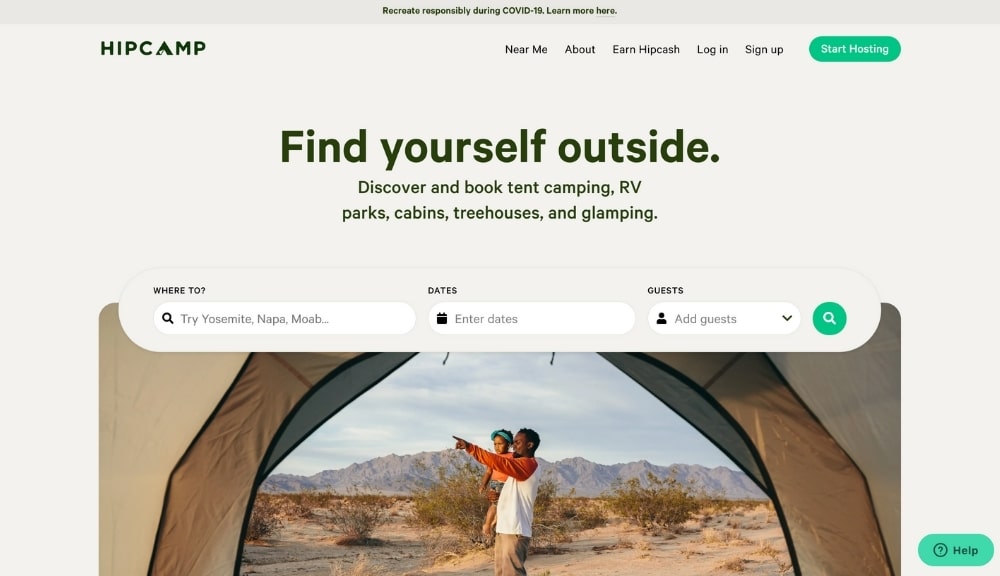
For people who like to be outside or aspire to take more adventures that involve the wilderness, who wouldn’t respond to “find yourself outside?” Hipcamp helps you find exciting locations across the U.S. to book a tent, RV, or go glamping.
Hipcamp uses data-driven design to improve its website performance. The search above the fold allows a visitor to explore new areas and sleeping styles in minutes.
Sometimes, pairing your UVP with a helpful tool such as a search feature provides the most value to prospect visitors. If there is a way to enhance your UVP with a simple module or technology on a homepage, it’s worth testing.
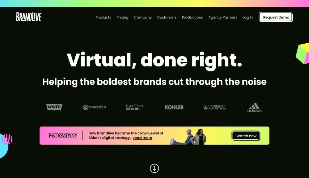
“Helping the boldest brands cut through the noise.” Not the shortest or precise, but it is probably the coolest. Brandlive’s bold heading above the UVP with “Virtual, done right” brings it together.
Often, the best UVPs are straightforward, but what Brandlive lacks in specificity makes up for it by being cool. Instead of taking the dry approach of saying something like virtual solutions for remote events, their word choice captures a hip flavor.
The words that you use in your UVP don’t have to state why you do or how you do it explicitly. A UVP that’s cool, modern, or unique can work well too.

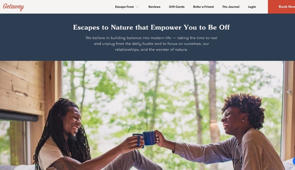
Getaway allows you to escape to a cabin in the woods to get away from modern technology and appreciate nature. Their UVP does a fantastic job of describing the end state of their solution—tranquility, and balance. Anyone stressed with the modern workday and technology sees how an escape may be in order.
Getaway’s UVP, “Escapes to Nature that Empower You to Be Off,” targets working professionals inundated with computer screens, cellphones, and the daily grind. By escaping from major cities like Boston, the accountant, HR manager, or entrepreneur has the opportunity to find balance with chirping birds, babbling brooks, and digital solitude.
Nailing Your UVP
It is imperative that you get your UVP right. This can often mean the difference between a quick visit and a long-time customer.
First impressions are so vital in attracting new customers, especially if there are many competitors in your field. Set yourself apart from the start. If you need help, you can get a free mastermind call with our marketing specialists to create the perfect Unique Value Proposition for you. One that encompasses everything potential customers will want to gain by using your services over the competition.
Ryan's experience ranges from higher education to SMBs and tech startups. When not doing digital marketing, he's sure to be enjoying some kind of nerdy pastime.

![]()

 Brandlive